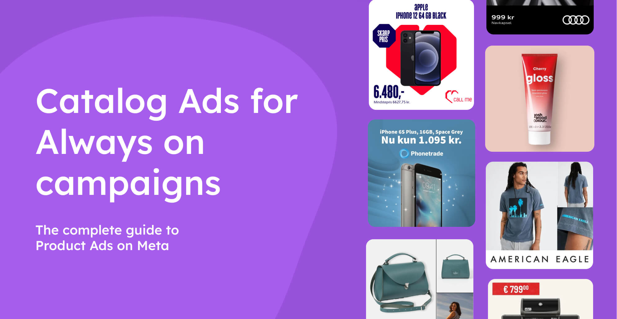
Catalog ads for always-on campaigns
February 6, 2024
Let's start by defining what "always-on catalog ads" are.
If you haven't started customizing your catalog ad creatives yet, all your catalog ads are probably what we would call "always-on".
This word simply means the design is not tailored to any specific seasonal campaign or special offer. Always-on catalog ads are default, fallback, or also known as "business as usual" creatives, typically promoting all your items.
- They tend to be the best-performing Meta ad format.
- Low maintenance and opportunity for a steady stream of revenue.
- They generally get the most live time, budget, and reach.
- Due to their prominence, using non-branded creatives can hurt branding.
Why customize the design?
> A higher quality creative leads to more actions (clicks, purchases, etc.).
> Actions and results provide training data for the Meta algorithm.
> The more training data, the better delivery, targeting, and ROAS.
Even though design choices vary by industry, the basic logic and overall tactics for always-on ads remain relatively unchanged.
Table of contents:
Levels of always-on catalog ads
Going from the bare minimum (no customization) to advanced messaging (full creative control), every advertiser will fall somewhere within this spectrum, depending on how advanced they are in their catalog ad optimization.
And the purpose of this article is, of course, to help you climb up that ladder.
Generic catalog ads
We would call this "generic" or "bare minimum" because it is just enough for the catalog ads to work. No customization has been done to the creative whatsoever.
- Unedited product images directly from the website.
- No distinct branding or message in the creative (focus purely on the product).
.jpg)
The downside is that there is nothing to set the images apart from your competitors - and since always-on catalog ads get most of the budget, this can be a dangerous move from the branding perspective.
.jpg)
The visual quality of the ad creative is completely dependent on your website media, which means that even "bare minimum" catalog ads may look rather good if the photography is consistent, though it's not taking advantage of all the opportunities for optimization.
.jpg)
Basic overlays
The next step is taking advantage of Meta's native creative customization.
The most common native Meta options are: frames and catalog information (i.e. price splashes)
- Doesn't require any third-party software.
- Option to show prices or discounts dynamically.
- Ability to add branding with a transparent overlay.
- It's not possible to edit the image, just place elements on top.
Many advertisers completely skip this step and go straight to custom designs, as Meta's catalog creative options are rather limited and don't always align with the brand image.
.jpg)
Frames can range from simple just to insert some branding (left) to complex (right). The key thing to know is that the frame will not change from one product to another - so it is possible to show the USPs of your store, but not the individual product.
.jpg)
Catalog information includes the possibility to show dynamically changing information such as prices, percentage savings, or free delivery (if applicable).
The creative options, however, only include the selection of a shape (rectangle, pill, circle, triangle), and the position and color of the shape (either automatic or manual), so it may be hard to make on-brand.
.jpg)
Custom catalog ad designs
This is the first huge leap in terms of visual appearance - a simple and clean on-brand design for all products, perhaps showing basic product information like price.
- Show any product information dynamically (prices, names, brands, etc.).
- Edit the entire product image, including the background and layout.
- Make the creative 100% on-brand.
- Add any manual text message or design elements.
Doing this is a low-hanging fruit - making your catalog ads instantly more visually pleasing, eye-catching and undeniably branded.
 (1).jpg)
You can even change the background based on the product being shown. This can introduce more variety into the scrolling experience and make it more interesting.
.jpg)
The big difference from the previous step is that you no longer just lay elements over your images, but you can position, scale, and edit them completely in layers, meaning it's possible to add backgrounds, just as it would in software such as Canva or Photoshop.
 (1).jpg)
And since you can adjust the layout and add more layers, you can use multiple images of the product as well. Amazing for showing off different angles or focusing on a particular close-up.
.jpg)
Highlighted unique selling points
If you're making a manual ad to promote a new release and another for a discounted product - chances are you would go with slightly different design choices to highlight these points, even though they both contain the same brand essence.
- Communicate product-specific highlights automatically.
- Make certain products stand out from the rest.
- Differentiate different categories or collections of products.
At this level, the design changes based on the product to communicate common unique selling points (like news or discounts) and other product-specific details (such as brands).
In this example, the circle elements are automatically applied to discounted items to highlight the savings.
.jpg)
And again, you can have total control over how to make this look (we call this a "savings splash"). It instantly draws attention to the main message - the discount!
.jpg)
Having full creative authority, you can make this very noticeable and clear (examples above) or less obvious (example below) - with the "sale" and "non-sale" creatives being just slightly different.
.jpg)
Doing this for discounted items is most common, and often most effective, though you can also choose to highlight other unique selling points, such as the items being in the "BESTSELLER" category or being new, with a small badge.
.jpg)
Alternatively, you may choose to use other graphic elements to show product information; for example brand logos to show the manufacturer automatically.
.jpg)
Embedded custom product information
Full dynamic and automatic control over the design; across all channels.
This can include adding custom product-specific details (like ratings, or badges for custom USPs) and scheduling seasonal designs to improve recency.
- Add custom product information to the design (i.e. ratings or materials).
- Use graphic elements like badges based on the product, instead of just text.
- Tailor the design to specific time periods and launch automatically.
The key thing with an advanced setup is that we want everything to be dynamic and automatic.
Setting up advanced conditions often times requires adding custom product attributes (custom labels or numbers not required by default) to your feed, depending on what you want to achieve.
One example is custom pricing information. You could choose to add "price per installment" to your products in order to show this in your design.
.jpg)
Alternatively, if you sell bundles, you can include extra price information such as how many pieces are in the kit, and how much more it would cost separately.
.jpg)
A custom piece of information could also be a specific USP - in this case what type of hair the product is for. You can show this via text (as this brand has chosen to do) or via design elements.
.jpg)
Going more technical with USPs, this example shows that you can provide basically any type of product information that your users may find valuable (computer specifications in this case).
.jpg)
Start designing your catalog ads
1. Make a solid always on design
- Start simple and clean (it will be the starting foundation).
- Add your brand essence, such as colors, font, and logo.
To start infusing your brand image into your catalog ads, you have two options in the beginning:
- Use Meta's native creative options
- Or jump straight to a fully custom design
How to decide:
Since native Meta options still very much depend on the original images from the website, take this into consideration.
- Try to make Meta options work if: Your product photography has a consistent layout and the same aspect ratio; the background is the same subtle color (gray or cream) across all products.
- Go straight to designing if: The aspect ratio of your images varies; the products have a pure white background; your brand has a very strict brand image.
1.1. Use basic Meta overlays
Depending on your product images, you may be able to create a nice design purely using overlays and Meta's native catalog information.
You can create an overlay in a tool such as Canva or Photoshop and export it with a transparent background - it will stay the same across all products - perhaps to add a logo.
 (1).jpg)
The product information you show, however, is limited to only prices, discounts, or free shipping (if applicable to the specific product). With Meta's overlays, there is no way to add, for example, the product's name or brand into the design.
.jpg)
1.2. Fully customize the design
With a custom design, you have a lot more creative options. You can still choose to show your logo, plus you can also scale, position the image, and even add more of them.
.jpg)
If you're unhappy about the background of your images, you can remove and replace them with a branded one.
.jpg)
With a fully customized design, you can, of course, also add price information - with more control over the color, font, size, placement, and even the ability to include more details, such as discounts and original prices - all at the same time.
 (1).jpg)
2. Show your unique product information
- Don't add too much product information at once.
- The goal is to use the most important and relevant details; not all.
- Get inspired by information you are already highlighting on the website.
The next step is to continue taking advantage of all the unique product information your items come with.
Whether that is by simply adding them as text or showing them visually via, for example, badges or elements; having key product details in the design accelerates the buying process, as users already start comparing products and deciding while looking through the carrousel.
2.1. Add information through text
The easiest method is adding what we call a "dynamic product field" (changes based on the product being shown) into a text layer.
This allows you to display virtually any product information included in your feed.
The most fundamental of these is the product's name - most commonly seen with electronics.
.jpg)
But the decision to show the product names can also extend well outside the electronics industry - if it is relevant, why not show it?
.jpg)
But as was mentioned, any information from your feed may be added. For example, the category of the item.
.jpg)
Or the brand of the manufacturer, as this is often important in the buyers' decision-making.
.jpg)
2.2. Insert product-relevant media
For certain product details, it can be valuable to use graphic elements instead of text.
The most common example is using brand logos instead of stating the manufacturer with text (as in the example above), if you sell items from multiple brands.
- A certain property, i.e. "brand", has different options (values) in your feed.
- An image file is uploaded for every option where an element should show.
- The dynamic "product asset" layer is added to the design.
Example: A logo uploaded for every brand in the feed.
Result: When (brand = Burberry), the correct logo is used.
.jpg)
An interesting use case is also further highlighting the color of the product to make it pop even more. This can be useful if the colorway of the product is relevant to highlight (i.e. if your store has only a few items, but many variations).
- An element in the design (i.e. frame) has "Color modification" enabled.
- The "Color modification" is set to dynamic (dependent on products).
Result: The color of the frame changes to match the product.
 (1).jpg)
2.3. Use custom product information (advanced)
Aside from the necessary basic product details (Facebook requirements), you can send and use any custom information in Confect.
Again, these may be used as text (the exact same text as in your feed) or for conditions to display elements.
This depends on your industry and the products you sell, but here are some common examples:
- Product ratings
- Technical specifications (for electronics)
- Materials used (for fashion or home products)
- Gender (for fashion, beauty and cosmetics)
- Collection name (for fashion)
A good example is also badges for products that are exceptional in one way or another, for example award-winners.
- A custom property is added, i.e. "custom_label_1 = award / no award".
- An award badge is uploaded for when (custom_label_1 = award).
- For when (custom_label_1 = no award), no image file is uploaded.
- The Product Asset layer is added inside the design.
Result: Only when (custom_label_1 = award), the badge is shown.
In this screenshot, the advertiser shows the award badge but also "wattage," which is a custom label as well.
.jpg)
3. Highlight unique selling points
- Focus on USPs that are always relevant (i.e. discounts and new releases)
- Use the standard design as a foundation for a consistent carousel experience.
With the use of conditions, you can assign a different design (but still on-brand and coherent) to selected products.
Inside Confect, we call this "Design Rules".
It helps these products stand out and get noticed, as users generally pay more attention to what is different.
The most common use for this is highlighting discounted products and giving them a slightly adjusted design, including percentage savings or the original price.
- Two designs are created, i.e. NORMAL and ON SALE.
- The NORMAL design is set as the default version.
- A condition is created so that when (sale_price < price), ON SALE is used.
Result: When an item is discounted, it automatically gets a SALE design, otherwise it uses the NORMAL one.
Notice in this example that only the products with a lowered price get the discount design.
.jpg)
This can be a different design (above) or just and added element such as "PROMO" text and the original price (below) for a more subtle highlight.
.jpg)
Alternatively, this may be done to highlight any other point you wish, using the fundamentally the same approach.
Some common examples are:
- New releases
- Bestsellers
- Low stock/ limited edition
- Free shipping on selected products
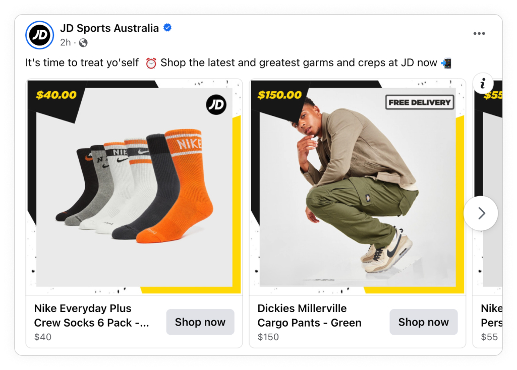
For example, here, FREE SHIPPING is most likely only offered above a certain price; so the cargo pants have this label applied automatically, while the socks do not.
4. Experiment with design in catalog ads
Though it's number four in this list, this step is probably the most important and impactful thing you can do to succeed with always-on catalog ads.
As with any type of marketing, just because something sounds good and looks good doesn't always mean it also works good.
With so many design choices and directions, what should one do?
Test and compare!
- Reliable results come when both test designs run from the same catalog.
- Two (or more) designs are added into a single catalog as "design variants".
- Inside the Ads Manager, two separate ads are created.
- Each ad is set to use a different "design variant".
Result: Multiple versions of the design (i.e. variants A, B, and C) run at the same time from one catalog - allowing you to compare performance.
Fundamentally, there are two types of A/B tests when trying to optimize your always-on catalog designs.
4.1. Broad A/B tests
- Take different directions and use a broad visual variety.
- Be a bit less strict; let your designers explore different options.
- Let the users decide which design they prefer - by buying from it.
- Great in the beginning to figure out the ideal design direction.
- Bigger visual differences between the designs (i.e., layout, colors and background).
Example 1:
Even though these two screenshots come from two different markets, it's a good demonstration of a brand taking their design in two opposite directions, while still staying on brand.
.jpg)
The design example above is quite subtle, while the one below is a lot more playful and vibrant.
.jpg)
Example 2:
Though there is only one difference in the next two examples - the background, they look quite different at first sight.
 1 (1).jpg)
Depending on the audience, users may respond better to dark, or light, colored designs.
 1 (1).jpg)
4.2. Narrow (specific) split tests
- Always start with the winning design from your broad test.
- Use specific questions as the foundation (i.e. "Should we have more images?")
- Better suited as a follow-up after a broad test.
- Once you find, for example, the best-performing layout, you can test smaller variations (i.e. amount of text, what product information to add, whether to add your logo, and so on).
In this example, notice that both designs use the same bottom elements and colors, but one includes more images of the product.
 (1).jpg)
This is a good example of a test aiming to answer "Is it better to have more product images in the design?"
.jpg)
5. Scale your catalog ads beyond always on
As we mentioned, your always-on design is THE FOUNDATION.
Now, it's time to take advantage of the work you've put in and build on top of it.
5.1. Go omnichannel and use your design across platforms
- A/B testing on these other platforms is not as easy as on Meta.
- We recommend you use the winning Meta design for coherent branding.
- Use catalog ads on all platforms where you run normal ads.
Though catalog ads are most popular on Meta, it's not by far the only platform that supports them.
You can use the winning, best-performing design across channels like:
- Snapchat (supports vertical 9:16 catalog ads)
- TikTok
- Klaviyo
.jpg)
5.2. Remix the design for campaigns and product sets
- Tailoring the design to campaigns or product sets is very effective.
- Keep the general layout of your standard design and make minor changes.
- For campaign designs, schedule these automatically in your catalog.
Your always-on design will probably run for 80% of the year.
So what about the other 20%?
Even when creating catalog ad designs for a specific period, a specific product set, or audience, we recommend you start with the always-on creative.
This leads to all your catalog ads being beautifully coherent, and importantly, it saves a ton of time when creating campaign designs - you just have to change some text, colors, and perhaps shuffle elements. Much easier than starting from scratch.
.jpg)
Wow, you read all of this?
You must really be committed to creating the best always-on catalog ads in the game!
Ultimately, the design choices you make depend on your brand, and on the product information available to you. If you need any help or want to discuss your options, or best practices, reach out to us in the live-chat.