Victoria Feliz Graphic Design Portfolio www.feliz-creative.com @designs_vfc victoria.feliz.contreras@gmail.com


My name is Victoria and being creative and fun is what I try to do. Outside of designing, I express creativity through dance, baton twirling, makeup, and art. As an artist of many mediums, each experience brings out inspiration that many aren’t aware of. I would like to provide my skills in illustration and UI design through the lens of someone who enjoys themselves in various creative outlets.

Beyond Animation
Magazine
SAM
App Redesign
The Fourth Wall
Zine
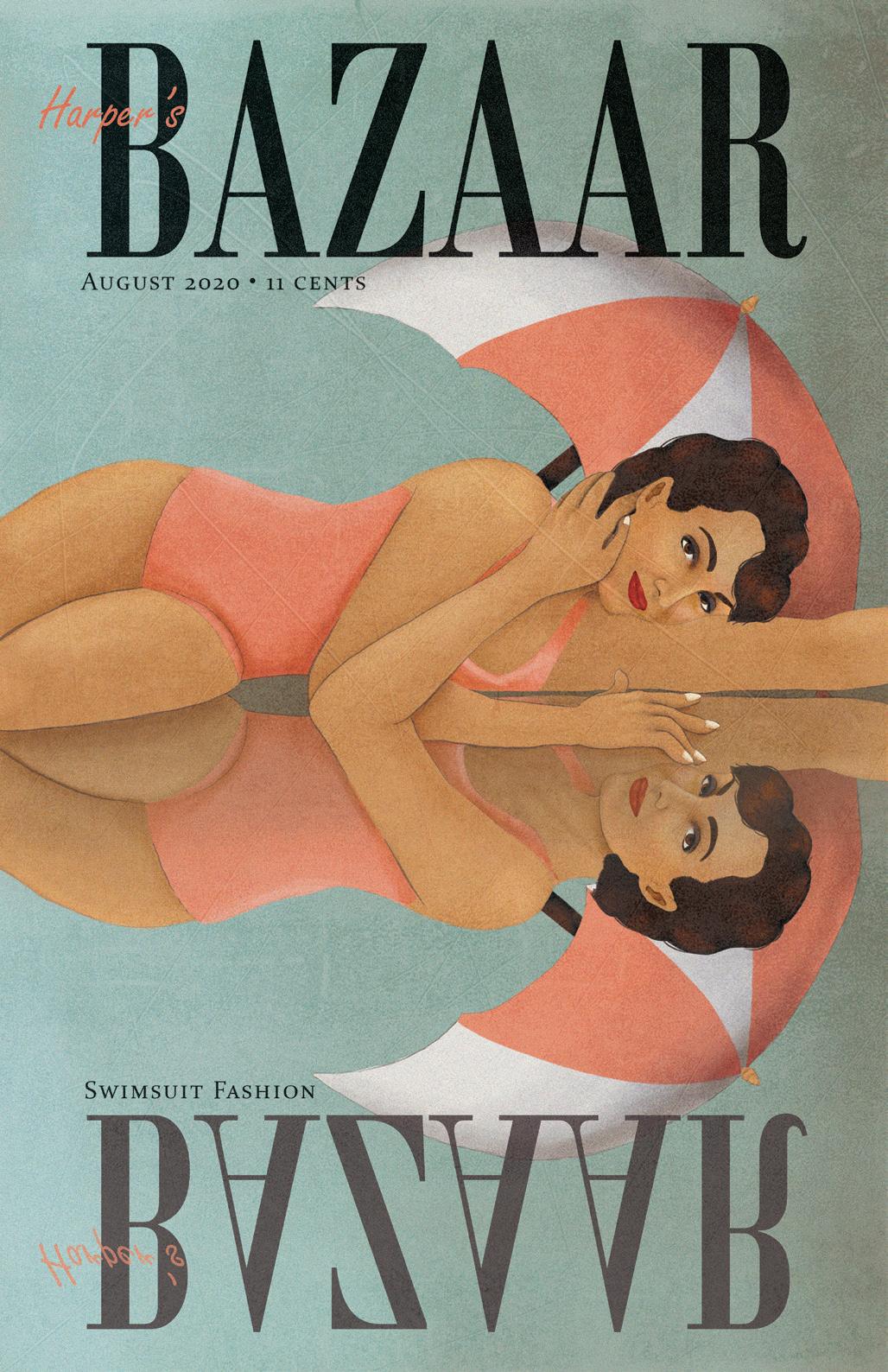
Harper’s Bazaar Cover
Poster
Telltale Games
Rebrand
Chow Could This Happen?!?
Illustration
Baton Twirling for Dummies:
Performance VS Competition Routines
Infographic
Extra Credit
Original App
Magazine Publication
Overview
Beyond Animation Magazine is a publication that covers a variety of animated media, including cartoons and VFX. This publication is meant to show that the art of animation can be enjoyed by anyone and everyone. Therefore, all aspects of animation are explored. This includes: movie reviews, behind the scenes, and the latest in animation.

Solution
I decided to create this magazine considering there weren’t many options for animation fans. Animation is a great form of entertainment that everybody can enjoy, not just children. So, the target audience for this publication would be teens and young adults. In order to appeal to this audience, articles were curated and information was illustrated in a way that presents animation as more than something you see on screen.
The Beyond Animation logo went through multiple iterations before landing on the final. The original thought was to include arrows to show the “beyond” part of the name. Then, I experimented with using a pencil to show the “animation” aspect. However, it was pointed out to me that the negative space within the ‘A’ displays a pencil already. So, the arrow stuck, and the logo was created.

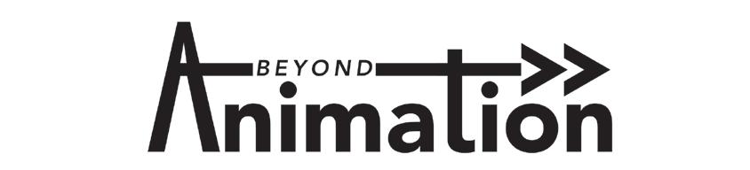
I started and ended up with a typographic logo. It’s simple, but the point gets across. With the combination of an oblique font and an arrow, “beyond” is represented visually. On the animation side of things, a pencil is created in the negative space of the ‘A’.
The color palette, black, red, and teal, is based on the animator storyboarding process. This also inspired the illustration style, but I will explain that later.
When choosing typefaces for this magazine, I wanted something simple, bold, and easily legible. the Azos Sans family was great for headings and captions while Merriweather served as a good body copy.
Header: Azos Sans Black
Subhead: Azos Sans Black Italic
Caption: Azos Sans Regular
Body: Merriweather


As stated previously, the illustration style was inspired by animation storyboards. I challenged myself to only use red, black, and teal throughout the magazine. Another challenge was finding the balance between the sketched and the detailed. The illustrations had to be sketched enough to feel like a WIP, but still detailed enough to be legible and have depth.


The S.A.M. (Self-Help Anxiety Management) App focuses on guiding users who suffer from anxiety to control and understand what they’re going through. The app has features such as a journal to write progress daily and mini lessons that teach what anxiety is and how to cope.


While the existing app has great features, they can be confusing to follow and utilize. It was a top priority to make the S.A.M. app easier to use. The app also had an outdated design, so it needed an upgrade to make it more modern and inviting. Lastly, the S.A.M. app had an opportunity that was unfortunately missed. The branding and voice were upgraded in the redesign alongside the new mascot, SAM the butterfly.
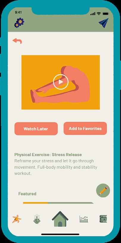
When planning an app–or anything user-focused–a user flow is beneficial. It helps the designer understand what paths the user may take within the product. In my case, I wanted to be sure to map out all the functions and features of the app, so I know where to make connections within the prototype.


Logo
The logo includes the newly created mascot, Sam the Butterfly. They fit perfectly as the ‘A’ and welcomed users into the app with a kind face.
Color
I wanted the app to have a calming and simple design. Considering it’s geared towards those with anxiety. The color palette is neutral with pops of color that don’t overwhelm the senses.
Typography
Along with the calm colors, the type is friendly and welcoming so that the text provides the user a presentation that is easy to understand.
Header: Barlow Bold
Body: Barlow Regular
LIGHT MODE
DARK MODE
#2A2773 #0396A6 #90A681 #F27E63When looking at the original app, I saw an opportunity. Meet Sam the Butterfly. They are here to help you through your journey of self-help. Sam came from the idea of having a buddy to guide the user and be a friendly face in a tough process. They’re also very cute.


 SAM Animation Storyboard


The “fourth wall” is a term that people use to describe areas in a source of media that breaks the line between reality and fiction. In the case of video games, this could mean drawing something from the in-game world out into the real world, or vice versa. Unlike the use of fourth wall breaks in various forms of media such as books or movies, they don’t create the same experience as when video games utilize it. The fourth wall in video games forms a special relationship between the player and the product. The Fourth Wall discusses the topic of its namesake, specifically within video games. The zine uses examples of games that utilize the fourth wall. Each section uses the voice of the game that is being talked about to immerse the reader as those games would.

Illustrated Poster
Overview
For this cover/poster, I was inspired by Cipe Pineles July 1949 Seventeen cover. The surrealist approach was a fun idea to me and very different from most magazine covers I have seen. I wanted to capture that style in my own way.


Telltale Games is described as the “pioneer” of episodic gaming and has inspired many video game companies with their array of games. However, in 2018 they shut down due to bankruptcy and were bought by LCG Entertainment the following year. At this point in time, they are presenting themselves as the “new Telltale.”
It’s being advertised that the company is “reborn,” and they’re making a comeback with new video game titles. However, the brand itself has remained the same since its beginning. Their brand doesn’t reflect who they are as a company today. Therefore, I took the opportunity to rebrand Telltale Games. I took inspiration from their previous games and spun that concept into this rebrand. Telltale is known for the comic book art style they use in their games and the dark and mature themes they have. I went in a comic book grunge-style direction for this rebrand.
Logo Before Logo After
My initial thoughts when designing ephemera were that it would either be sold at gaming conventions at the Telltale booth, or it’d be limited edition items. This still is the intention, but the thought was expanded into selling merchandise on their website as well as conventions. Limited edition items would mostly be collaborations with other brands, such as the controller I designed for PlayStation consoles.


The original website was simple and clean. While it works as a website, it doesn’t work with their brand personality. In my design solution, I chose to use a majority of white on the page so that it remains easy to look at. However, I still included some dark grunge to fit with the rebrand.


In the gaming community, many conventions are held to connect people and introduce new products or promote existing ones. I thought a convention booth would benefit this rebrand as a way to promote and introduce the “new Telltale” and promote upcoming games.


Illustration
Overview
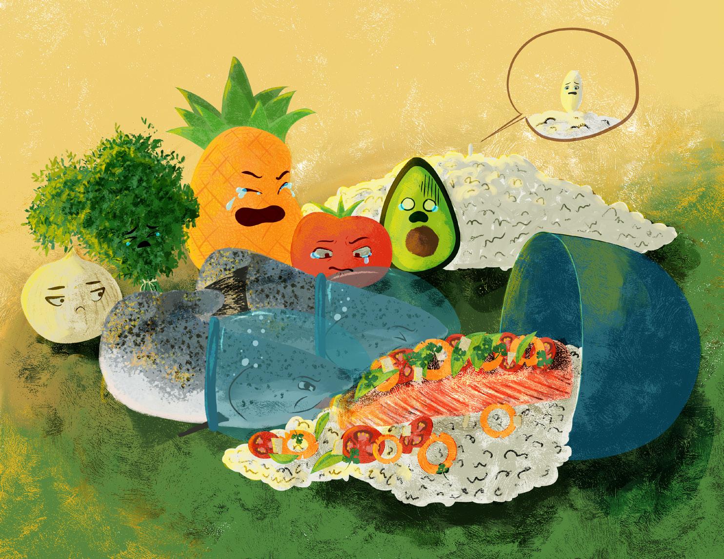
On this illustration, I wanted to have fun and just draw. I didn’t want to illustrate a meal. I wanted something a bit more engaging. So, I decided to illustrate a scene of a spilled salmon dish with the ingredients mourning the accident.
I decided to design an infographic based on a sport I love and participated in, baton twirling. This infographic compares performance and competition routines based on my experience performing and competing in Texas. I compared the two based on several factors: types of tricks, the inclusion of dance, and the routines themselves. I also included a comparison of the amount of each routine I did in a year.


The Extra Credit App provides college students and recent graduates a platform to learn about financial credit and its purpose in today’s economy. It also provides a way to track that credit to ensure their credit score is in good standing.


During the process of user research, many students mention having financial struggles. This was mainly due to not being taught what was needed in their younger years. There wasn’t a credit-specific app or program outside of the general financial literacy apps. I wanted to use this opportunity to create something valuable and useful to the users through fun aesthetics and easy-to-understand lessons, along with the real-life lesson of keeping track of the credit they earn.
When interviewing and surveying students, the three main difficulties they had were: finding jobs, financial help, and understanding credit. Now, credit and financial help do go hand in hand, however, the students who expressed concerns about credit were very passionate about the topic so that determined it’s own topic. It also determined the route I wanted to go with this app.
Extra Credit h ad gone through two iterations before the final solution. The first focused on usability, the second on design, and the final on polish. From the second draft to the third, there was a major evolution in aesthetics. This was due to taking a break from the project, then looking back with fresh eyes and feedback from the target audience.


From the beginning of execution, I wanted to use a visual metaphor within the logo. I wanted to combine the credit card and graduation cap to play with the idea of “taking lessons” in credit.

The final logo shows a grad cap and credit card combination in between the title “Extra Credit”. As stated previously, I wanted to show a visual metaphor within the logo. The title is cleverly named after the concept of taking extra credit in school, while also referring to credit as a financial factor.

While the design is simple and clean, I still wanted some pops of colors. The main color palette is light purple, dark purple, and pale green. This serves as a chic and simple palette for a fun and simple design. The rest of the palette, yellow, blue, and red, were used sparingly to give the design some pops of color.
Considering I didn’t want to overwhelm the user, I chose a clean and friendly typeface. Proxima Nova is versatile with its use and gave me many opportunities within the layout.
Header: Proxima Nova Bold
Body: Proxima Nova Regular
Loading Screens