The New Pro Church Tools Logo (And Brand) Revealed
One of my goals this year was to put Pro Church Tools through a proper rebrand, design a new logo, and launch a fresh, new version of prochurchtools.com - our website.
Now, the last time we did this was about five years ago.
To be clear, I'm not suggesting that your church go through a rebrand every five years. And I'll get to why we did this in just a moment.
But first, I want to show you the different iterations of the Pro Church Tools brand over the years so you can see how we’ve grown and what impacts our design decisions today.
So, let’s get to it!
Version 1 Logo & Branding [2011-2014]

This is when the company was just me. I barely knew my way around Photoshop.
Here I really was just downloading different elements from the Internet and placing them next to each other.
Version 2 Logo & Branding [2014-2017]

Fast forward a few years. Now, the team has grown by a couple of employees. But we still didn’t have any full-time designers on staff.
We mainly were video folks at this point, so where did I go to find help with this version of the logo? Fiverr.
And I got this gem of a logo made up for us - where the 'P' and the 'C' for Pro and Church are in the same letter design.
From there, we continued to grow. We got some designers on the team, some really, really talented people.
And so we did a rebrand for real - really for the first time - where we actually put thought into our values and DNA and how to express that visually.
That's what gave us V3 of the brand.
Version 3 Logo & Branding [2017-2023]

And this is what we've been using and enjoying for the past 5+ years.
Which begs the question…why change it?
The simple answer is - we outgrew it. Not in the sense that the design became outdated. I still think this design looks great.
But five years ago is half the life of our company.
I'm in my 30s now. I was in my 20s then. Both the company and I have grown up a lot and changed.
And so we wanted a brand that could better embody where we are right now and where we see ourselves going.
Challenges of the rebrand
I wanted to share the challenges we walked through in this rebrand - because it won’t be a smooth process for most of us. It won’t always land right away.
So if that’s been your experience, don’t sweat it. And if you’re considering a rebrand, don’t get discouraged when you hit those stumbling blocks.
Things I knew we needed to consider
First, we film our content in several different places.
We have the podcast studio, which is light and bright. And we have the YouTube studio that’s dark and punchy.
The brand needed to be able to work in both of those contexts. So, my first thought was a black and white brand.
Riding the wave of the light and dark mode designs that we're seeing with operating systems and apps seemed like, functionally, that would make sense.
For example, one of the sites I had in my inspiration bucket for this was Cal.com.

As you see, they've got the dark and light mode thing going on, but it still has some personality and warmth.
As we started rebranding, we focused on this idea as inspiration. Here’s what design came up with in terms of exploring that inspiration in different directions:
Concept #1. (Mild)

This first option had colors that I liked but felt a bit too safe for me - which doesn't match our company's personality or vision.
Concept #2. (Medium)

This next one felt too corporate. You know, just overall, it felt a bit soulless.
Concept #3. (Spicy)

The third direction was promising, though. I really liked the black and white.
The grid elements stood out to me. And I liked the textures on the backgrounds. So this was the concept we decided to explore in greater detail.
The Revelation and Final Design
Here was the problem…
The more we got into it, the less I was feeling the design.
And surely you know this creative gut check.
It’s that feeling when you're in a project and the work is looking good, and you can't quite put your finger on what it is, but something's just not clicking.
I was getting a bit anxious because the more we went down this path, the more likely it became that this was what we were sticking with.
And then, one day, I was on my morning walk, and it hit me. I whipped out my phone and sent an email to design that read:

At last, we had our heading.
Inspiration: Blank VHS tapes from the 90s. Not only was this design just gorgeous, but thematically, it made sense as well. Because it was perfectly representative of my generation - Millennials.
We grew up in an analog world. And then digital hit us in the face in adolescence. My most treasured blank VHS tape was my recording of Vince Carter's slam dunk competition from 2000.
I must have watched that thing 300 times as a kid. And, sure, VHS tapes are a relic from the past now, but look at this design:

*chef’s kiss*
So, we changed directions slightly. Design started augmenting the work, and we landed on something really special.
Before they showed it to me, they made sure to add this little disclaimer:
"No more walks."
Alright, understood. 😅
Addressing the Brand Name Challenge
Now, before I show you the logo, fonts, and colors we landed on and how the new designs all look…
We need to discuss the biggest problem that hasn’t been solved. I've avoided mentioning it until now. And that is…
Our company's awful, awful name: Pro Church Tools.
And look, I've been honest about this for many years. The name came from an email from an old friend on a whim. He was like, "You should just start a blog, call it Pro Church Tools, or something, I dunno."
Fifteen years later…the company name remains.
Now, why is this name so bad?
Well, it doesn't really mean anything. It's just three words put together. And because it's three words, it often gets stylized incorrectly, which tends to aggravate me.
ProChurchTools or ProChurch Tools. No, when you write it out in plain text it's Pro Church Tools.
Three words. Each word is capitalized.
Also…it’s really long. So when we're designing a logo, that makes things tricky. Plus, you can't shorten it cause how do you pick which word to take out? Pro? Tools? Church?
It's all bad.
Just an atrocity of a name.
Not to mention, we always have to add Pro Church Tools with Brady Shearer at the end of it because it's also a personal brand in many ways.
The name is pretty useless on its own, so it needs that addendum.
Which, if you ask me is the ultimate indictment of this clown name.
And guys, come on, we need to stop calling our companies Pro Church [insert different word]. I am not the model for this. Don't copy us.
Don't make the same mistake I did.
Anyway…
We got the naming right with our products: Nucleus and SocialSermons.
Very nice. I learned from my mistakes.
Nonetheless, Pro Church Tools it is.
the logo reveal. ..
This was our old logo.
A little arrow coming out of a bracket. It symbolizes us entering the biggest communication shift in 500 years.
My request to design for the new logo?
Ditch any kind of symbol altogether.
Instead, let's just have the logo be a wordmark. It's already long enough as it is - this is one way to shorten it.
So, drum roll, please…
This is our new logo!

You can stack it up to get it closer to a square shape.

Or you can elongate it. We also came up with these really cool badges.

Super retro. The 167 reference is to seizing the 167 hours beyond your Sunday service each week. And then we've got some stickers as well.

New Colors
We settled on black and white. True to the original direction of the rebrand. But also a cream color to imbue that retro VHS blank tape vibe.
Then, red, gold, and blue are secondary colors.

New Typography
For fonts we went with Neue Haas Grotesk as our primary typeface with Ki Monospace as our secondary.

Here’s why I like this font pairing: Ki is giving old VCR/camcorder on-screen display font vibes. Neue Haas Grotesk is a modern, Swiss, clean design at its best, so we have that modern and retro pairing, which is really the life force of this new brand.
New Website
Thew new website is also live! (you’re reading it right now).

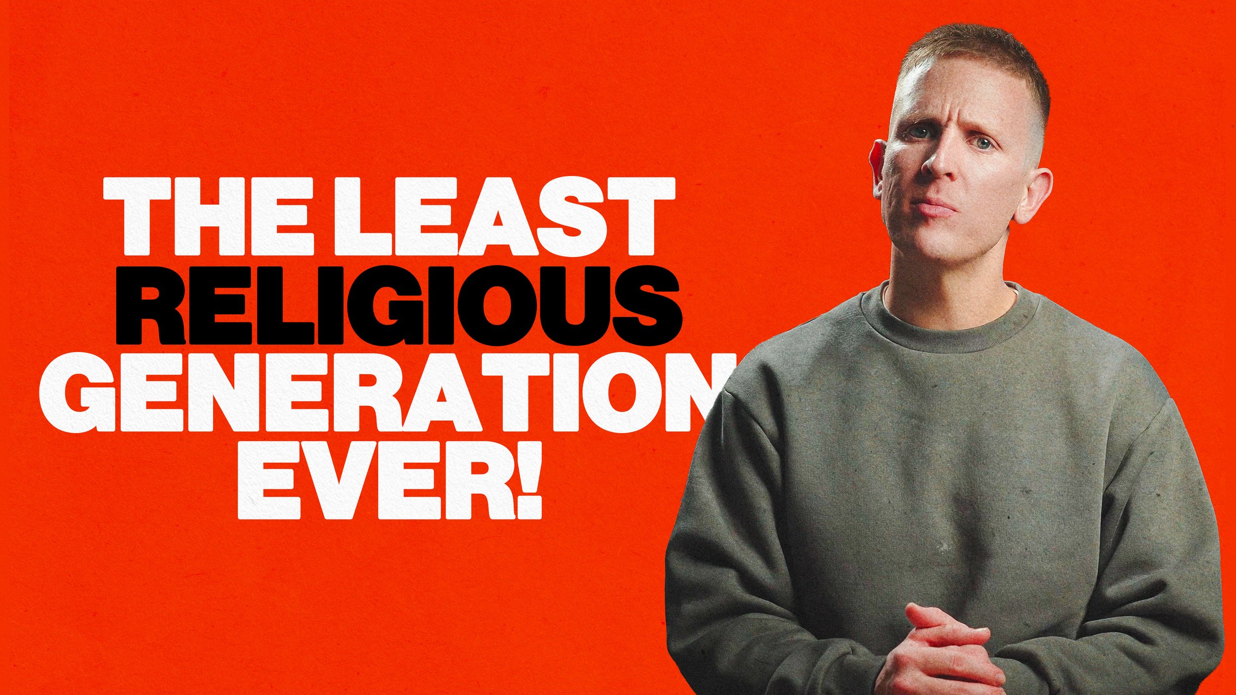
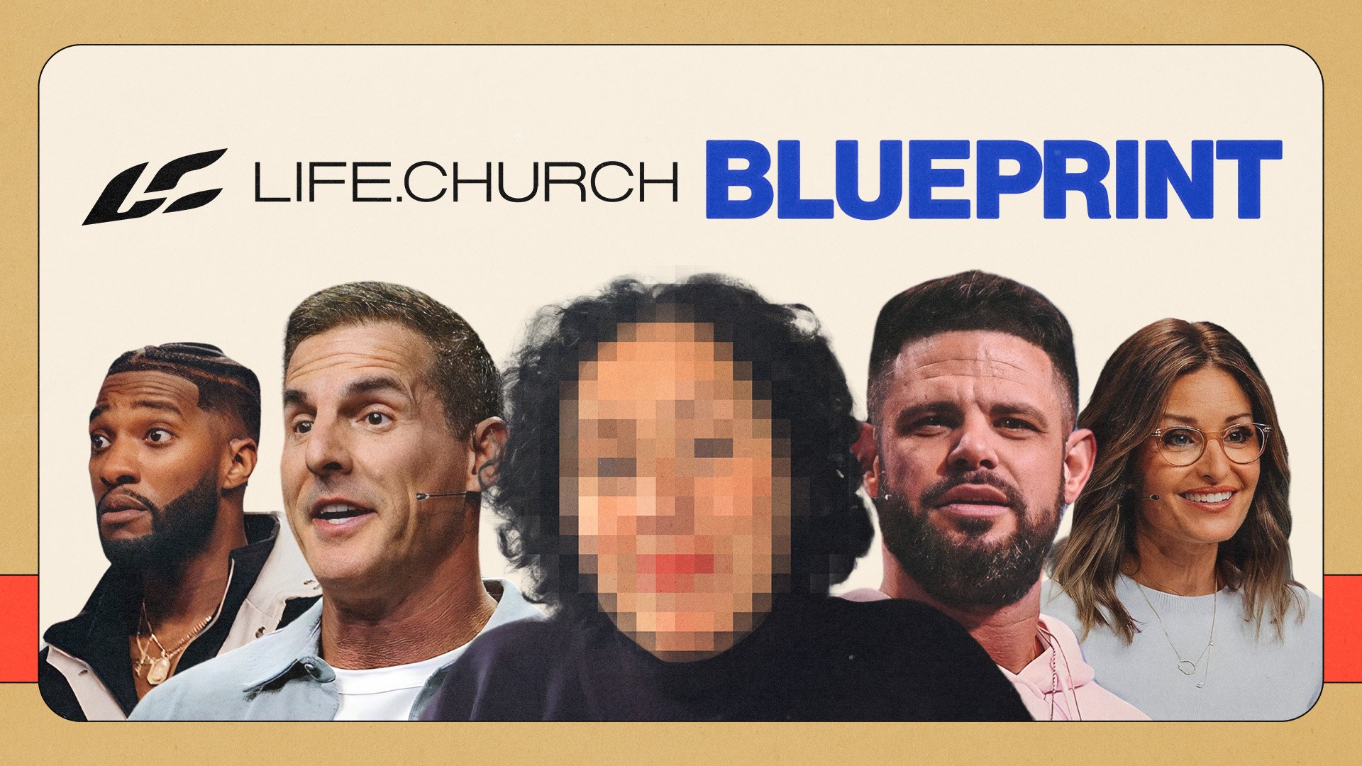
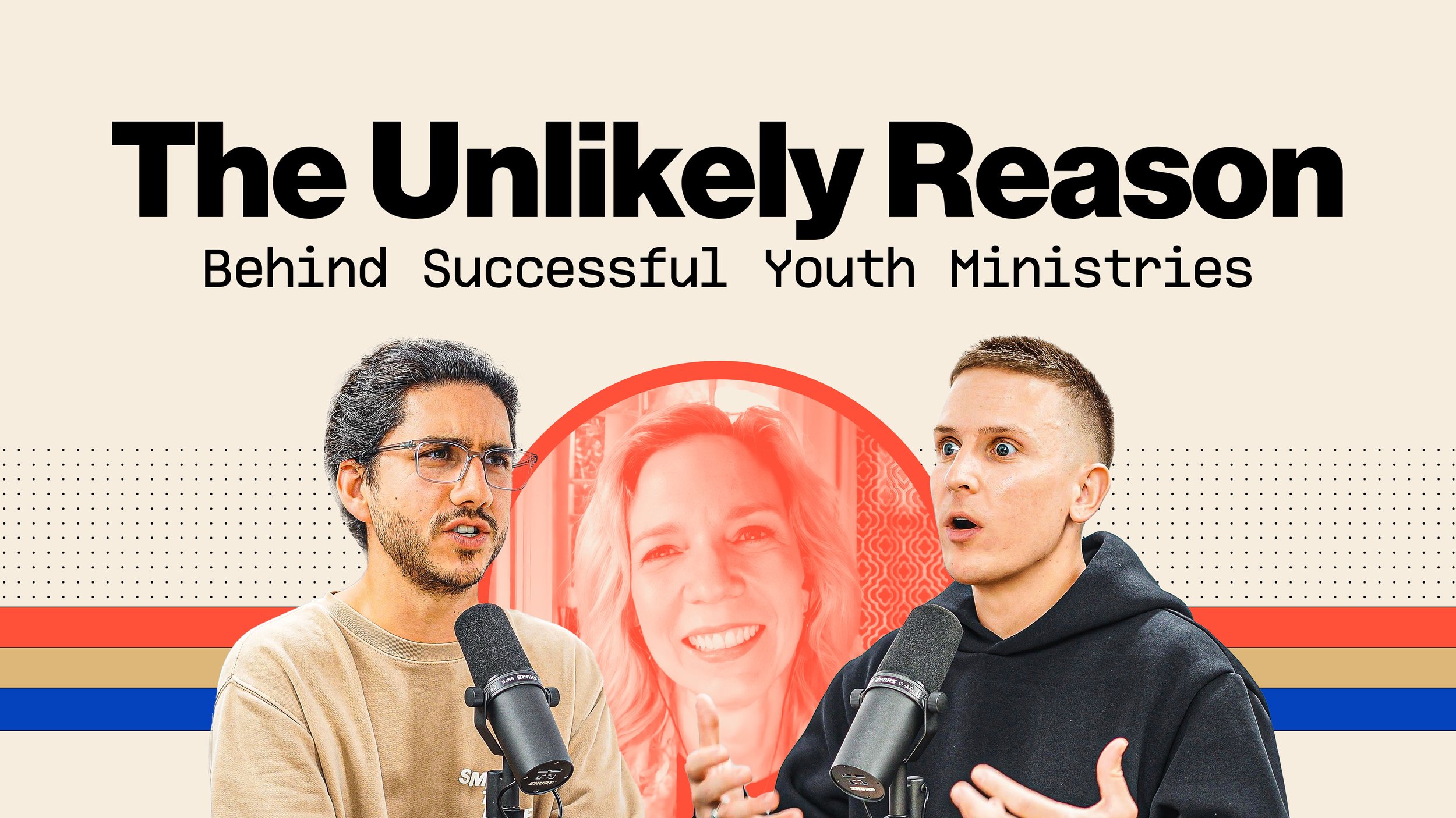
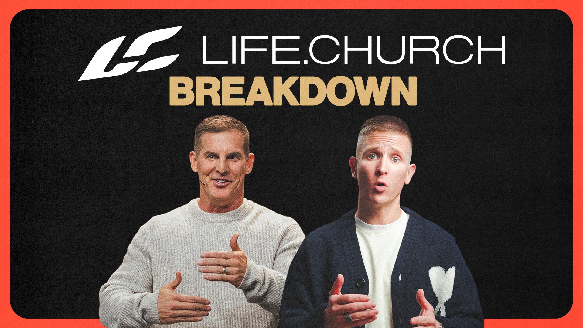
New Social Media Designs & YouTube Thumbnails
But the big test was social media.
How would we take this brand and create two unique kinds of YouTube thumbnails?
Solution: Light version for the podcast. Dark version for the main channel. And I have to say, I've been very pleased with the early returns.


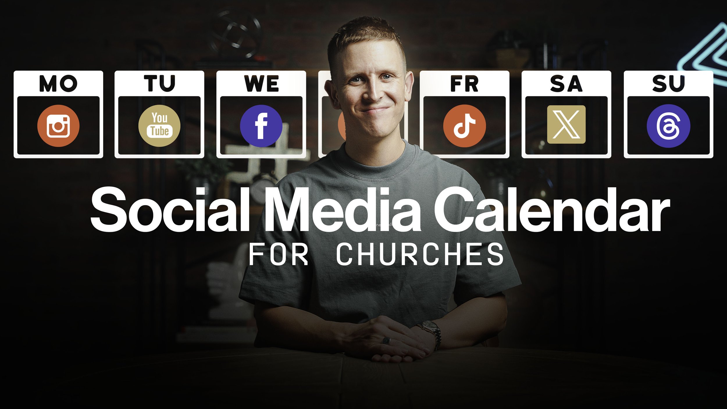
The carousels on Instagram have also looked great with the new brand. All in all, I couldn't be happier.


You'll be seeing this brand in a ton of new ways in 2024. So we're really excited about that.
And I wanted to talk you through the whole rebrand process in this post because not all creative projects are smooth.
But, if you stick to it and have an understanding team to work with, you can always course-correct and come out with something you're proud of.
Wrapping Up
To that end, I've got to shout out to the design team that worked with me on this.
And this is interesting because while we do have a team of 20+ creatives at our company, including designers and web developers, for the first time in a long time, we haven't used them for this internal project.
We needed them to focus on building Nucleus, our church website software.
So, I looked elsewhere for this rebrand.
The team we used are our friends over at Church Media Squad.
Stephen did the work on the branding.
Ashley did the work on the web design and dev.
Ivy's been doing a ton of the design work for Instagram and YouTube.
Why Church Media Squad
Earlier this summer, we started using TheSquad for a few extra social media designs…
And they were so good with that…that we had them do some video editing for us.
And then some copywriting…
And then some more design work…to the point where when we were ready for a rebrand and saw they had just released a new branding service, it felt like the perfect match!
This is not a sponsored blog, by the way.
I don't get any discount with Church Media Squad or anything like that for mentioning them.
But I wanted to shout them out because they've been such great partners, allowing us to focus our internal resources on the products we're building.
So shouts to them.
Conclusion
I'd love to hear your thoughts, though - what do you think of the new brand?
The new logo? The new website? The new fonts?
Feel free to add your voice in the comments here.
And thanks as always for your time, attention, and trust. We'll talk soon.
More Posts

![My Favorite Church Design Trends [Spring 2024]](https://images.squarespace-cdn.com/content/v1/651c5ee7bbb58f6bf652c2cd/1714483914980-E7FC03CT3I3VZRRU7MP9/Thumbnail.jpg)