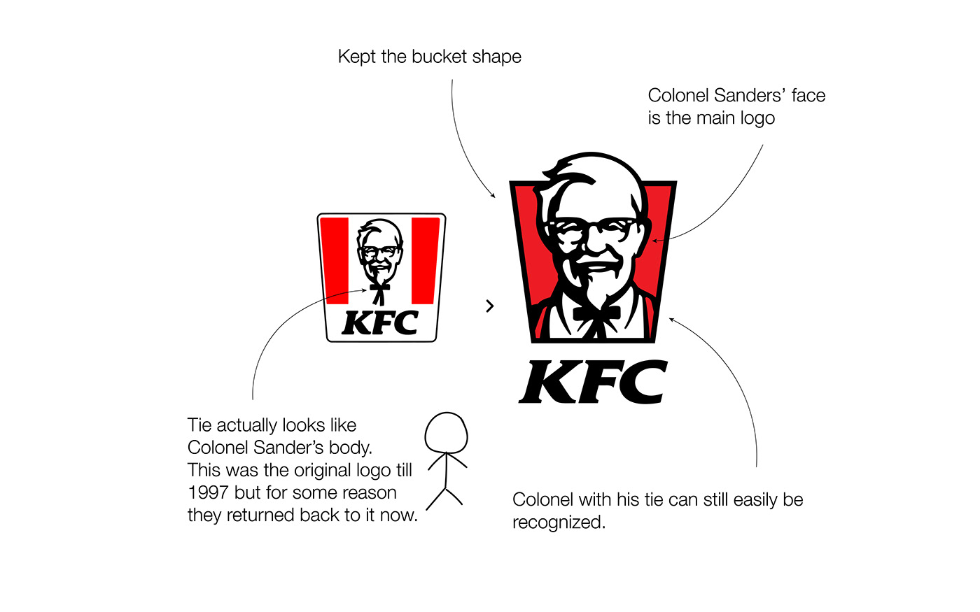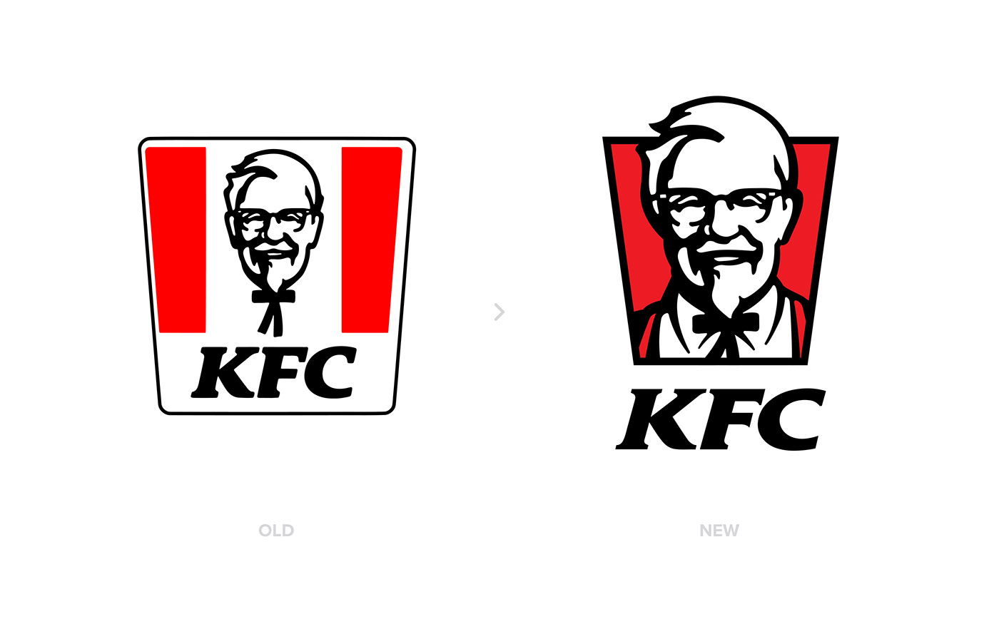
Till 1997 KFC was using a very minimal Colonel Sanders icon as their logo. Even though the overall look was nice, there was a big problem as his tie was looking like his body of a stick man. KFC updated their logo a few times but then this year, they went back for the original logo. If you check second image, you will realize the stick man and you will never be able to not see it :)
So what I did was to keep Colonel's face with the bow tie, but it doesnt look like a stick man any more. Also when you think about KFC, a bucket full of chicken is the first thing coming to my mind. They had the bucket as well but I updated their version slightly.. I thought the bucket is like a window opening to the most successful chicken franchise of all time. So I created the look like Sanders is looking at us from that opening.
This was not a major update but still, I think this logo really needs a touch. Let me know your thoughts about it.
Follow @designer.murat ✌🏻
————————————⠀
Looking for a custom logo design?
↳ hello@designermurat.com