Hackathon.io
AngelHack has introduced, through its hackkathon platform - Hackathon.io, hackathons, virtual competitions, accelerators, incubators, and internal innovation programs to corporations, government entities, and nonprofits in over 100 cities around the globe to the diverse community of 160,000+ startups.

Project Overview
User concerns about the interface of Hackathon.io prompted the initiatives of usability study and design overhaul of the entire site. In addition, AngelHack is looking to raise its competitive edge and increase revenue by expanding current services provided for corporate clients.
The Team
Project Manager, Lead Developer, Regional Managers, Ambassadors, Marketing, CEO
My Role
Conduct user interviews, summarize interview notes, identify issues with current user flows, concept development in wireframes, define the aesthetic direction, prototyping
Deliverables
User Interview Summary, User Flows, Wireframes, Aesthetic Direction, Prototypes

Problem Definition
Through user interviews, the most common problems in terms of usability are identified as …

The homepage is not impactful …
The current design jumps right into hackathons search page and causes confusion for users upon entry into the site.
Sign up/ Log in process is not smooth …
The process is tedious in terms of profile setup and lacks social platform sign up/log in options.
Inconsistency in layout format …
The layout format is consistent in hackathons and projects pages, but not in network page which has a similar function of displaying search results.
Users complain that some information and action areas are scattered and hard to find.
The list format of displaying the content is outdated and not easily viewable by most users.
Design Proposal
Start with the layout design in a consistent theme, but differentiates based page’s function and hierarchy…
Sign Up/Log In Pages
options of popular social platforms or conventional email & password

Home Page
banner areas for content displayed in icons/blocks based on visual priority from top to bottom
allow expansion and new additions vertically

Primary Pages
for pages of searching in events, projects, network, community
results displayed in icons/blocks for ease of viewing at a glance

Subsequent/Privilege Pages
for viewing event, project, member or discussion in icons/blocks and interacting within the page
for privilege functions in the highlighted area with accent color
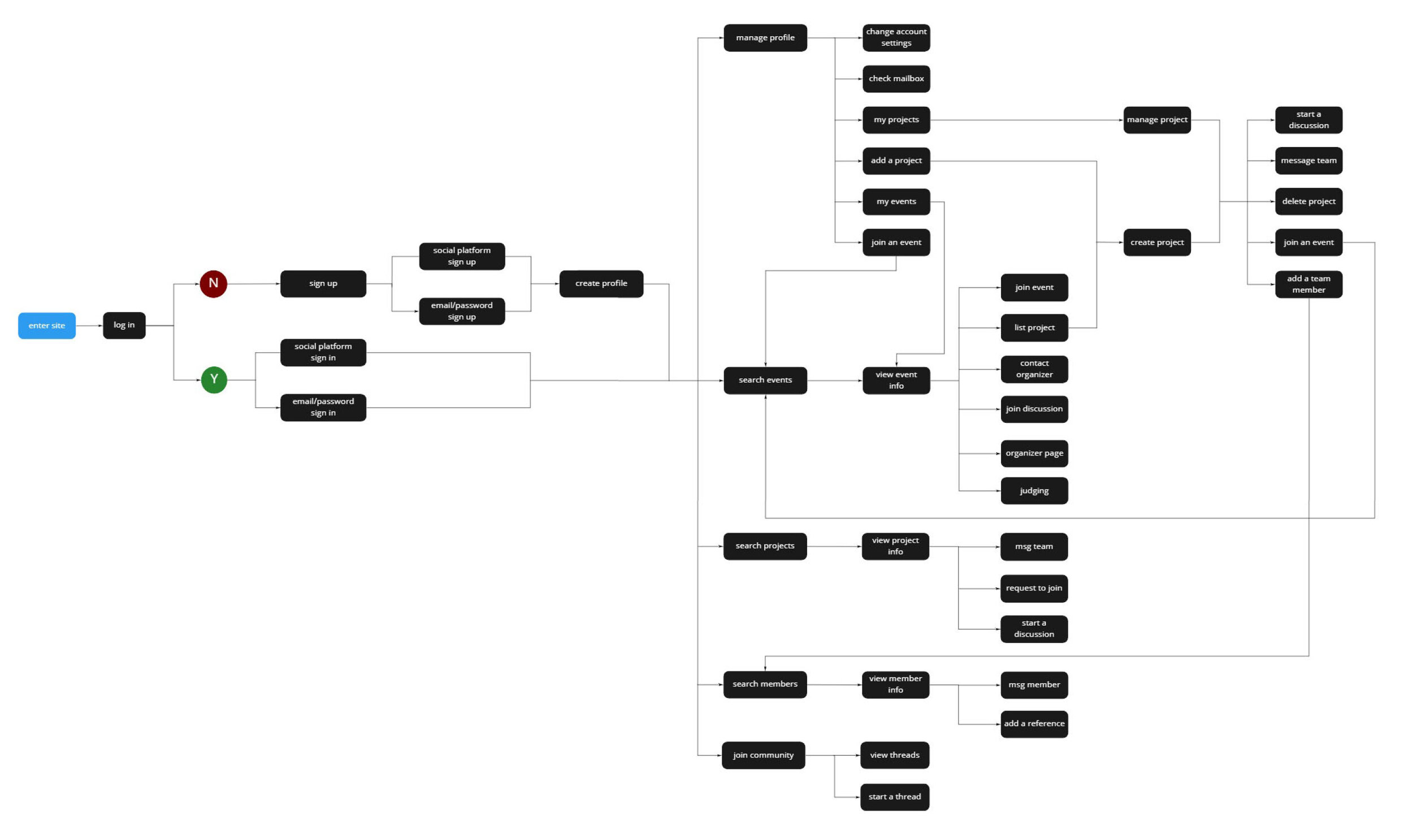
User Flow
Define red route of common user functions and structural relationship between pages …
Wireframes
Initial design concepts are visualized through black & white wireframes ...

Aesthetic
Define the visual approach through research on color schemes, emotional implications, and competitors …
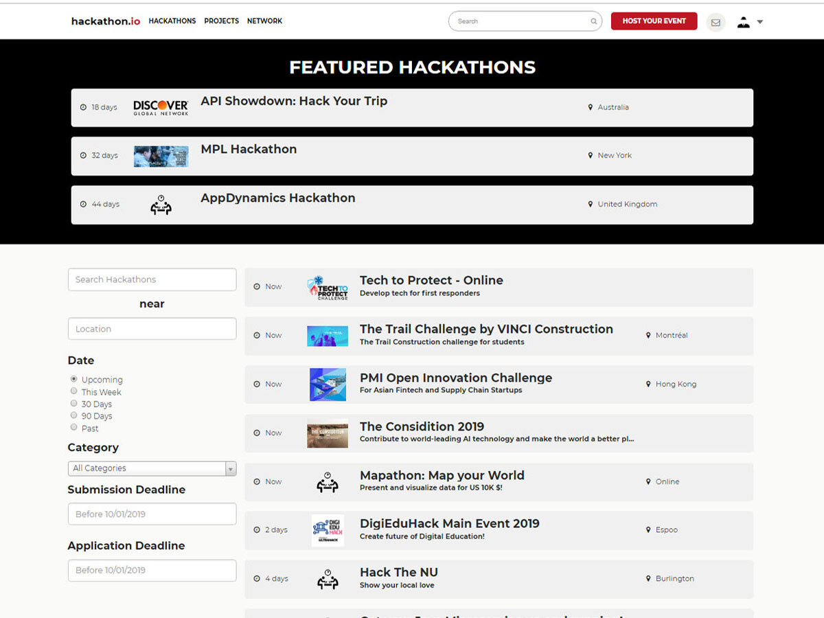
Current design
A black color scheme with red CTA buttons, corresponding to the logo
Competitor Study
Overview of direct competitors’s design schemes

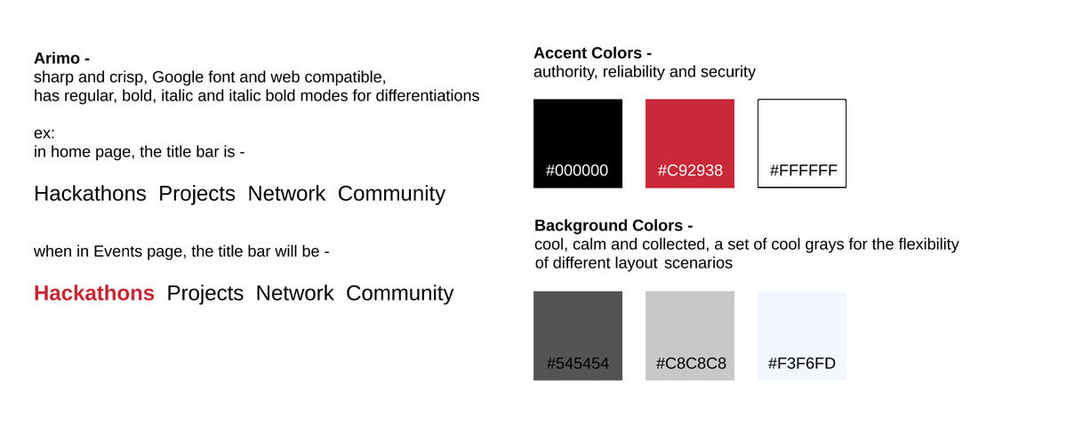
Color Scheme
In the high-tech industry, simple neutral color schemes are commonly adopted


Aesthetic Direction
Stay true to the original logo color scheme of AngelHack and Hackathon.io to reflect the sense of authority and reliability
Prototypes
Apply the aesthetic direction to wireframes and refine the visual details according to each page’s characteristics & specifications ...
Home and Sign-in Pages
Utilize banner area in accent color to emphasize priority information
Adopt popular hacker social platform sign-in

Search Pages
Top banner displaying featured event/project/member in scroll
Left area for filter selection
Search results displayed in icons of distinctive shapes with essential information to differentiate categories
Search results displayed in indexed pages for easy navigation

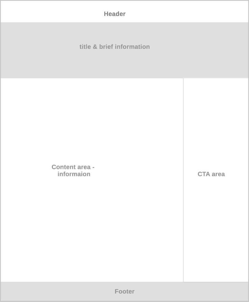
Subsequent Pages
Brief information of each event/project/member is displayed in the banner area on the top of the page
Content area contains more detailed information
Right area houses a list of appropriate action items for easy access

Findings

It was well-receives to visually distinguish between similar pages while keeping the consistent format throughout.
The superior visual impact of icon/block/image display over text display is proven.
Simplifying the grouping of information in a page layout helps users navigating a new page.
The reaction to the design direction is split - while some hope for a complete make-over, others fear for a confused brand recognition among existing members.
The decision to stay with the original color scheme, but update the design is considered a good compromise.