7 Basic Elements of Design
During the few last month, I’ve had the opportunity to work with talented designers on exciting applications and products. This work is something that really attracted me to the role and made every day truly unique.
Now I continue to learn my User Interface design course. User Interface design is a hugely popular field that’s growing rapidly, it can be hard, even impossible, to know where to begin.
So I decided to clear things up a bit to start!
When I started to learning UI design the purpose was to go in-depth on visual design and become familiar with basic terminology so I have familiarity with some of the powerful features in visual design anyway.
Creating beautiful design is about more than inspiration or a great idea, it’s about understanding the fundamentals of the subject. I think it’s possible to spend years studying the nuances of design and the many varying takes on how to be successful at it.

Recipes may vary, but all works of art and design contain a combination of the following elements.
From this, I was able to enter the design world and start thinking “creatively”. I started to learn base the psychological aspects of design: why it can look good and why it can fail.
1. Color
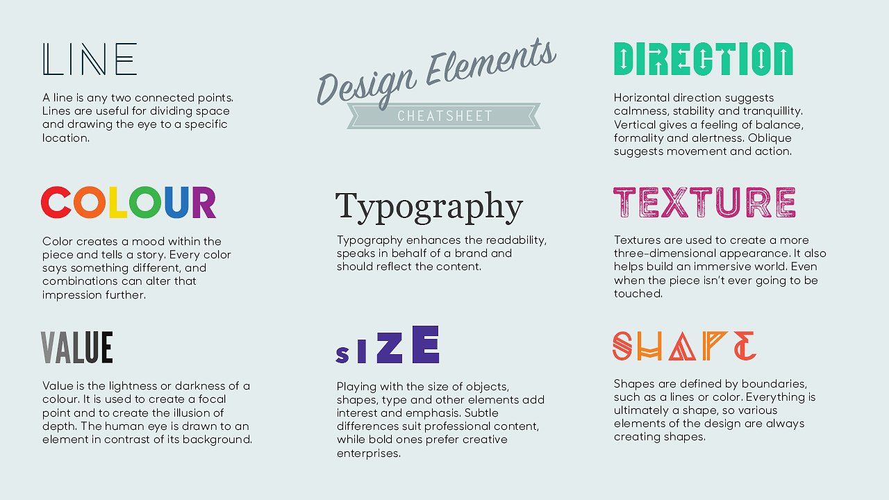
Color is one of the most obvious elements of design, for both the user and the designer. It can stand alone, as a background, or be applied to other elements, like lines, shapes, textures or typography. Color creates a mood within the piece and tells a story about the brand. Every color says something different, and combinations can alter that impression further.

The vocabulary of color includes:
Hue: refers to the names of the primary colors, red, green and blue.
Value: lightness and darkness of the color - the amount of white or black added.
Intensity: the purity or saturation of the color
Monochromatic color: use of one color where only the value of the color changes
Analogous colors: colors that are adjacent to each other on the color wheel, e.g. yellow and green
Complementary colors: colors opposite to each other on the color wheel, e.g. Blue-violet and yellow, represent colors positioned across from each other on the color wheel. Complimentary colors exhibit more contrast when positioned adjacent to each other, for example yellow appears more intense when positioned on or beside blue or violet
A Spectrum of Possibilities: The Go-to UI Color Guide
Best Three Color Scheme for UI Design
2. Line
The first and most basic element of design is that of the line. In drawing, a liene is the stroke of the pen or pencil but in graphic design, it’s any two connected points. Lines are useful for dividing space and drawing the eye to a specific location. For example, think about how a magazine uses lines to separate content, headlines and side panels.

6 Tips for Designing With Lines
3. Shape
Shapes, geometric or organic, add interest. Shape are defined by boundaries, such as a lines or color, and they are often used to emphasize a portion of the page. Everything is ultimately a shape, so you must always think in terms of how the various elements of your design are creating shapes, and how those shapes are interacting.


4. Typography
Perhaps the single most important part of graphic and web design is typography. Like color, texture, and shapes, the fonts you use tell readers you’re a serious online news magazine, a playful food blog or a vintage tea tins shop. Words are important, but the style of the words is equally essential.
Text represents more than 90% of all information on the web. Typography is a cornerstone of web experience. Even right now, when you read this article, the words written in it are visible simply because of typography.
Typography can be daunting to learn and that’s why not all designers are ready to invest their time and energy to master this skill. Some designers ignore typography because they think it isn’t worth their time.
When it comes to typography design, it’s vital not only to make the text legible and readable but also to convey a certain mood. The compelling typography is key to great UI design. And that’s the primary reason why every designer should master typography.

Font Sizes in UI Design: Principles & Resources
Using too many fonts in a single design can be a struggle to adjust to. Consistency helps readability. Rule of thumb advice is to use 2 fonts (3 at most) and to contrast a serif and sans-serif font. Perhaps one for body copy and one for headings.
5. Texture
Texture refers to the surface quality or "feel" of an object - smooth, rough, soft, etc. Textures may be actual (felt with touch - tactile) or implied (suggested by the way an artist has created the work of art -visual).
Texture adds a tactile appearance to a design layout. Imagine how a design piece would feel if you touched it. The goal of texture is to add depth to a 2D surface. Texture can be applied graphically through patterns, either digitally created or an image mimicking the desired pattern.
Stylistically, it is not ideal to blend multiple textures in a design (unless necessary) as it can be overwhelming for the viewer.
In this article, I showed the basic elements that need to build up design. These building blocks are essential to understand in order to create a successful design piece.

10 Principles Of Readability And Web Typography
6. Space
A vital part of any good graphic design, Space is the area around the elements in a design. It can be used to separate or group information. Use it effectively to give the eye a rest, define importance and lead the eye to where you want it to travel.
Negative Space
White space—also referred to as “negative space”— is the areas of a design that do not include any design elements. The space is, effectively, empty.
It is all too easy just to concentrate on the shapes (images, text, graphics) we place on a page when generating a design and forgetting about the negative space that surrounds them. Even something as simple as page margins needs careful consideration to ensure this negative space is used to it’s full potential. Negative space gives the eyes a place to rest, which in turn helps the reader to consider and absorb the other elements on the page. As a result, the underlying message of the design is better communicated.

A lack of white space in web design might lead to confusion, disorganization and also makes it difficult to read and enjoy. Those are things you do not want your viewer to think while looking at your work. Now, going towards the opposite direction, an excess of white space could be associated with a lack of content and as a consequence the loss of the viewer´s attention.
Have you ever heard the term “this design is very busy”? This is most likely due to the fact that there is not enough space surrounding the elements. Space visually organises elements on a page; it helps to create focal points, special relationships and areas of interest.
Negative Space as a Powerful Element in Design with Examples
7. Size
Size is used to convey importance, attract attention and create contrast.
In design, size can function, size can attract or size can organize.
When you are designing a piece, size plays an important role in making a layout functional, attractive and organized. Think about how the piece will ultimately be used and whether the its use will end up limiting the size. For example, if you are designing a brochure, will it need to fit in a #10 envelope?
The second factor is using size to attract your audience. You can contrast large and small elements or make a image larger and crop it in an interesting way.
The third factor is using size to organize piece. To attract viewers attention, we can make the most important element the largest and the least important element the smallest. Headlines are usually the largest type element on the page, while subheadlines, and body text is smaller. Larger objects appear to be closer on the page than smaller ones, and that can be used to reinforce importance and create artificial spacial relationships.

Conclusion
Understanding and implementing the principles covered above is vital to the success of any design project.
Designers should aim to understand how each of these design principles actually impact their work. Studying how other designers have implemented these ideas to structure their own designs is also an incredibly valuable tool in learning to create better designs.
There are hundreds of rules and many more principles when it comes to creating beautiful designs, but these are the basic essentials that will ensure anything you create is professional and perfect. I will continue learning path looking at the another essential elements and principles of graphic design.
