Study of the correlation between the price chart and the volumes of transferred cryptocurrency funds through the example of Bitcoin (BTC)
Dear friends,
Each investor's goal is making profit from their investments. But what do we base our buy or sell decisions on? When choosing a position in the market, beginners mainly use technical analysis. They build resistance/support levels, set up the Fibonacci grid, and try to calculate which Elliott wave is currently displayed in the price of the instrument. More advanced traders also analyze fundamental indicators.
In this block of analytical articles, we will consider the influence of two indicators, which can be categorized as fundamental:
- total volume of transferred cryptocurrency within the blockchain
- separate large transfers between wallets within the blockchain.
We will consider the example of Bitcoin as the most popular cryptocurrency asset.
In the first article, we will look at the total transferred volumes.
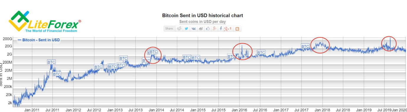
To analyze the dependence of the change in the Bitcoin exchange rate on the increase in transaction volumes, we will use the “sent in USD” tab of the bitinfocharts.com service.
The chart above shows the dynamics history of the volumes of transferred cryptocurrency. We can see a steady growth trend in transactions since the end of 2013, which tends to repeat every two years. In order to identify the pattern, we will look at each of these peaks in sequence and compare it with the price movement.
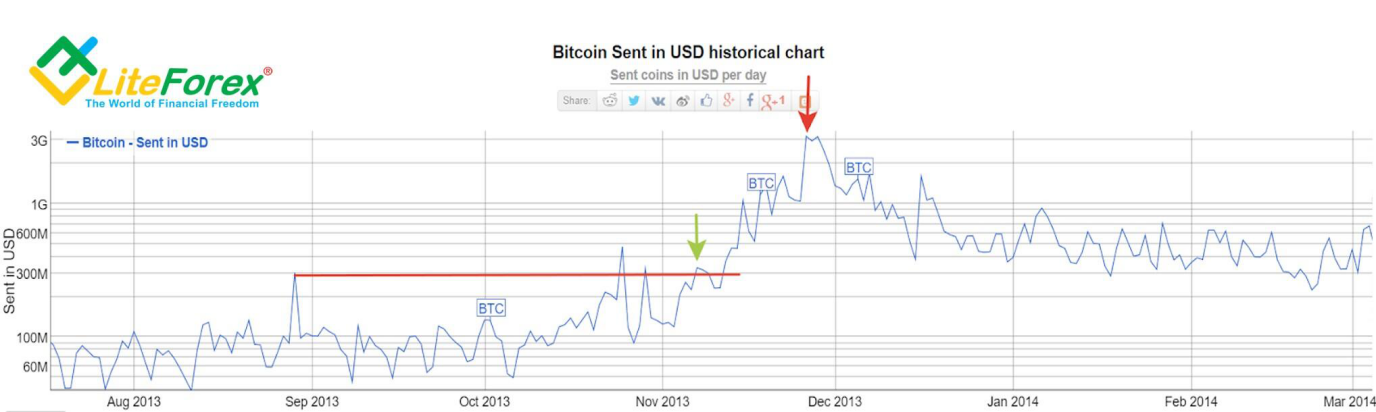
We see the first visible peak in volumes of sent bitcoins around November 26, 2013 (the peak is indicated by a red arrow in the chart above). If you look at the history of the peak, the relative transaction volume begins to increase steadily starting November 2013, when the price already exceeded the height of a single peak for the third time. This is a signal showing an anomaly in the blockchain network.
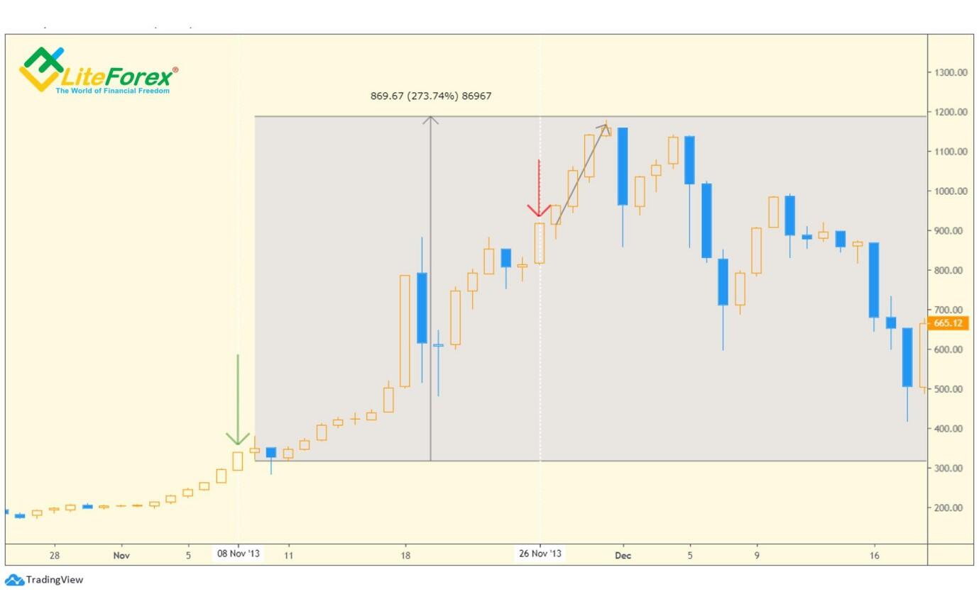
If we combine this chart with the Bitcoin price chart, we will see that the anomaly in the volumes of sent coins coincided with the beginning of a strong bullish wave, which showed an increase of almost 300%. We see in the chart of the volumes of sent coins that the growth high was reached on November 26, 2013, and then, despite the growth in the exchange rate, we do not see highs updated in the sent coins, which in the classical technical analysis is called divergence (multidirectional movement of the indicator and the price itself).
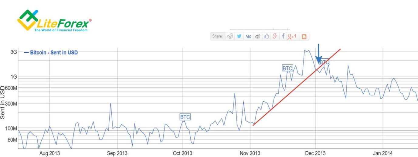
On December 3, 2013, a breakdown in the conditional growing trend of the volumes of sent coins occurred (in the chart above, the breakdown is marked with a blue arrow).
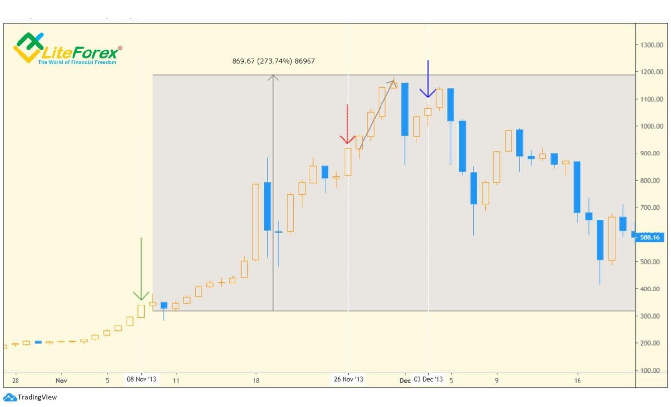
As you can see in the bitcoin chart, at this moment the price rolled back upward a little. In general, this was the right moment to close the position, so in this case, volume signals gave very accurate entry and exit points.
To be sure of this pattern, let's see how the price behaved in the other growth peaks of the sent coins.
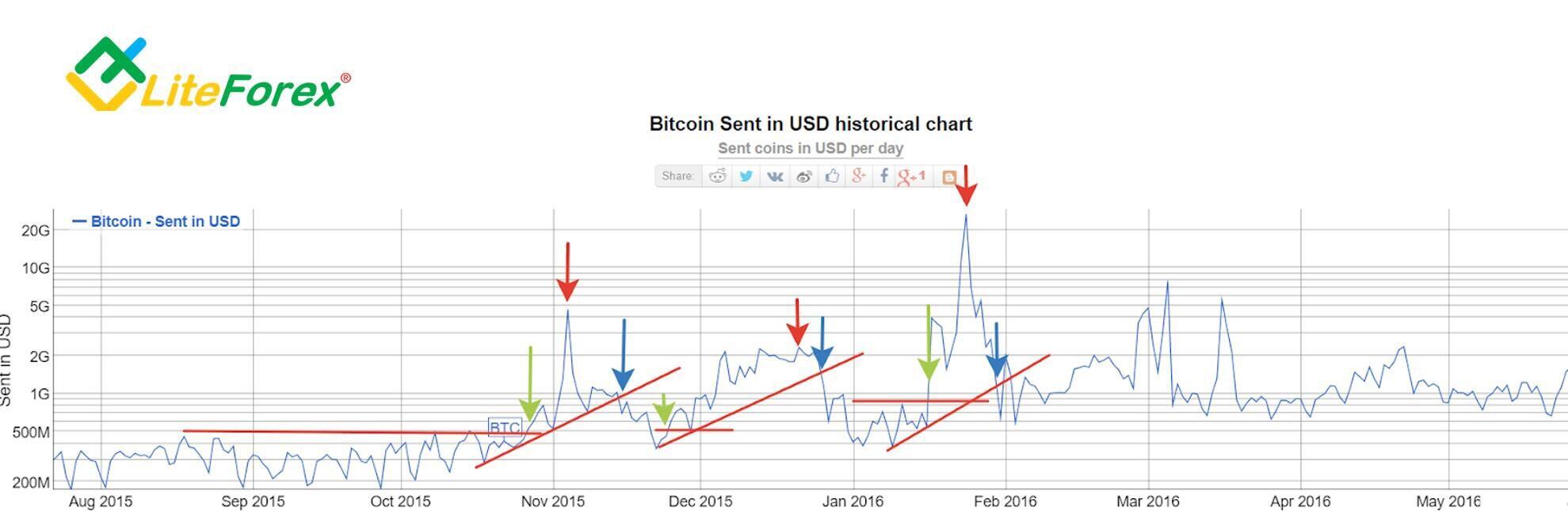
The next abnormal activity of the sent Bitcoin volumes occurred in late 2015 - early 2016. In the chart above, the green arrow marks the breakdown of the corridor of the volume indicator, i.e. potential signal of the beginning of abnormal growth. The red arrow marks the peak, and the blue one shows the moment of crossing the hypothetical trend line.
Let's see how these points fall on the bitcoin price chart.
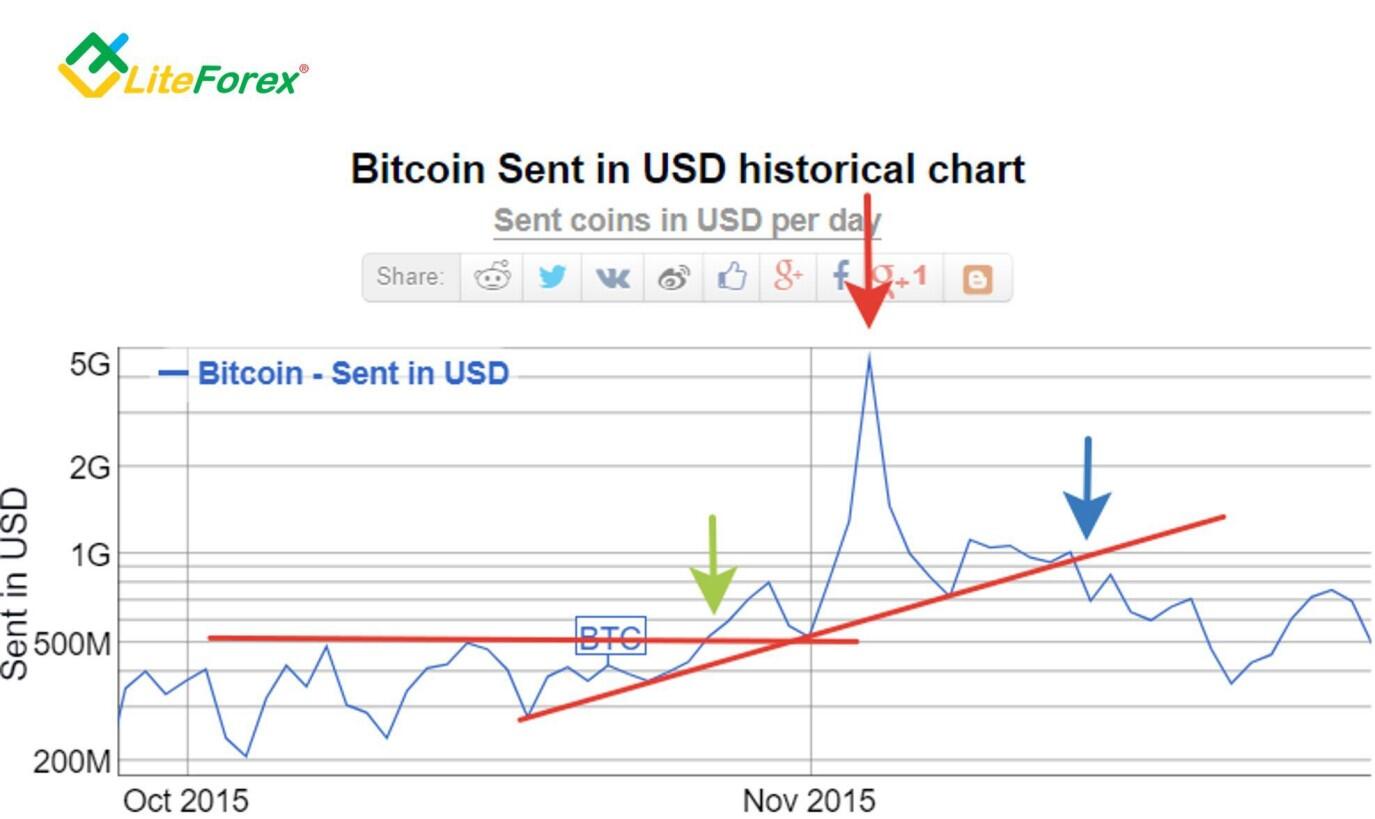
In the chart above, we see the first anomaly in close-up. A surge in sent bitcoins occurred on October 28, 2015 (green arrow). The peak of volumes - the red arrow - falls on November 4, 2015. Exit below the trend line is marked with a blue arrow on November 15, 2015.
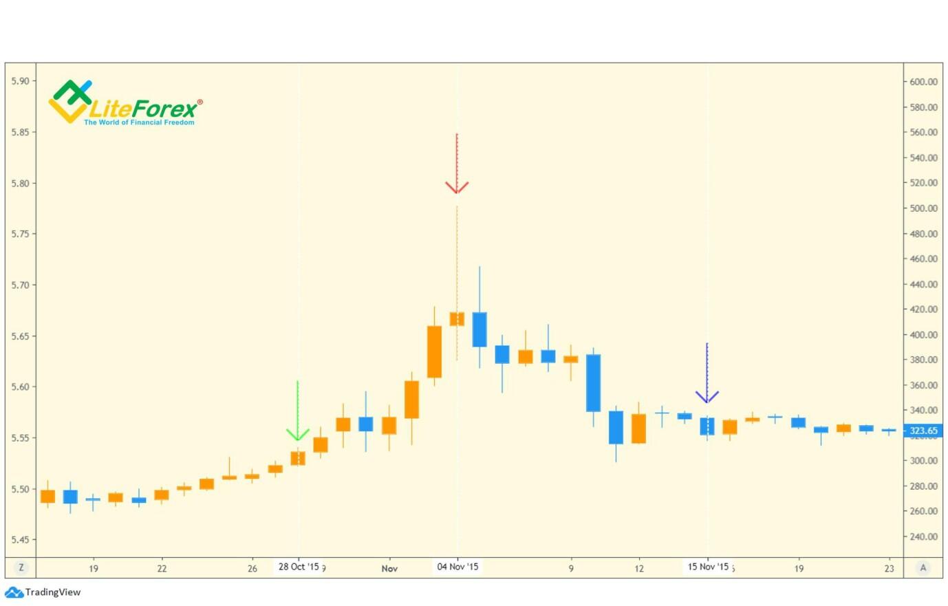
In the chart above, we see that the green arrow pointing at the beginning of the anomaly is at the start of the bullish trend, however, the peak of volumes coincides with the peak of the price, which does not give us any advantages in forecasting. The blue arrow that indicates the breakdown date of the growing trend of sent coins lies at the bottom of the bearish correction. Therefore, this signal is also useless in terms of forecasting and trading.
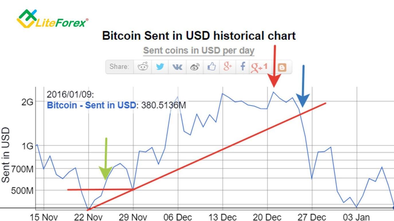
The next volume growth anomaly begins on November 25, 2015. The peak of volumes of the sent coins came on December 21, 2015 and right away we see the exit below the trend line – December 26, 2015.
The feature of this anomaly is not the impulse-like view, but a dense and uniform increase in volumes over quite a long section.
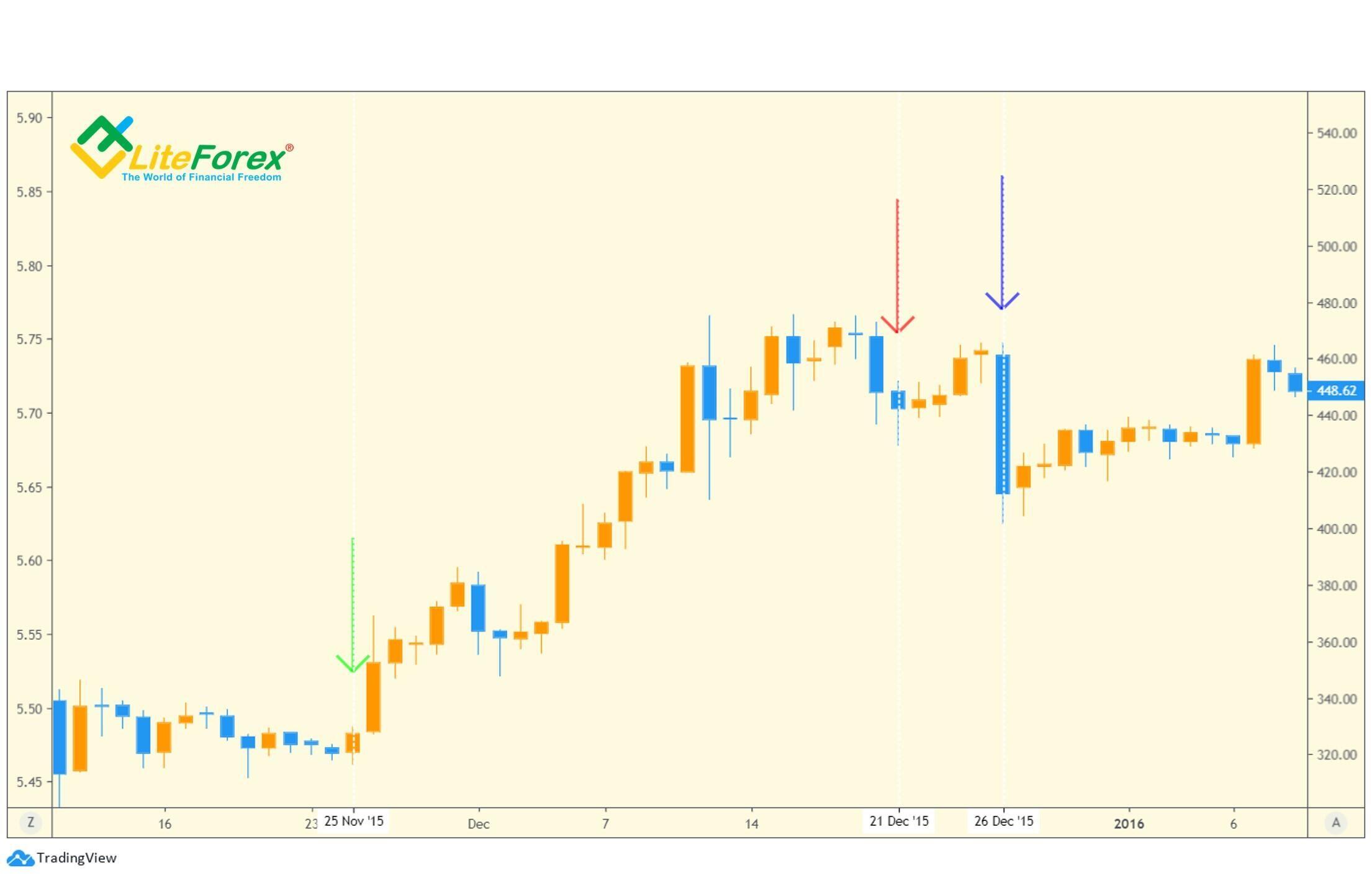
In the price chart, the situation is the same as in the previous case. The green arrow marking the beginning of abnormal growth in volumes coincides with the start of a bullish trend. At the same time, the peak of volumes falls into the area of the price chart where the trend is already shifting to the negative zone, which can be considered the first bell of the beginning of a bearish trend since we observe a divergence in the directions of the indicator and the price.
The blue arrow marking the breakdown of the growing volume trend of sent coins coincides with the impulse of price downside movement and does not give any advantage to the holder of a long position.
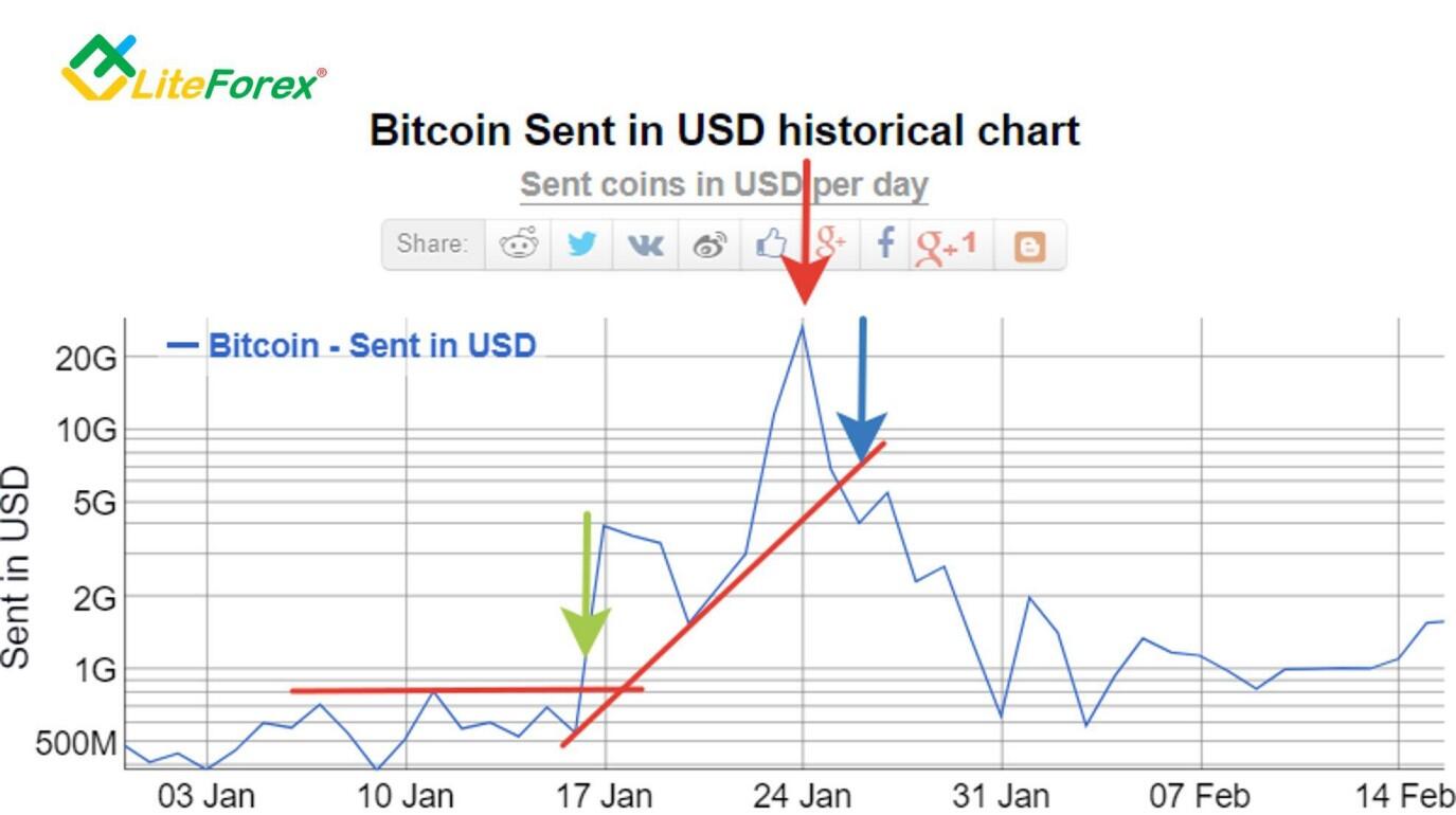
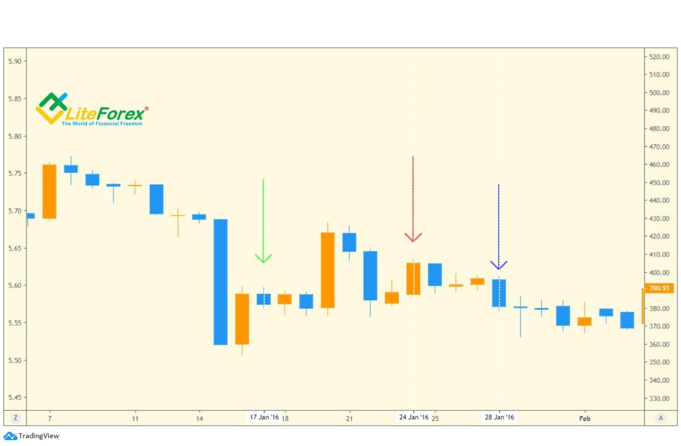
The next volume anomaly begins on January 17, 2016. In general, we see from the green arrow that this signal is leading and occurs several days before the pulse. However, the peak of volumes marked by a red arrow in the price chart is already falling back after a strong bearish correction, in other words, we would not be able to sell on the high price. We can talk about the divergence, which again signals a trend reversal. The place of the trend breakdown marked by a blue arrow coincides with the bearish momentum and no longer gives advantages for an early exit. In other words, this signal is useless for the trader at the moment.
Now, let's consider the most hyped period in the entire crypto-industry when the price of Bitcoin formed its historical high.
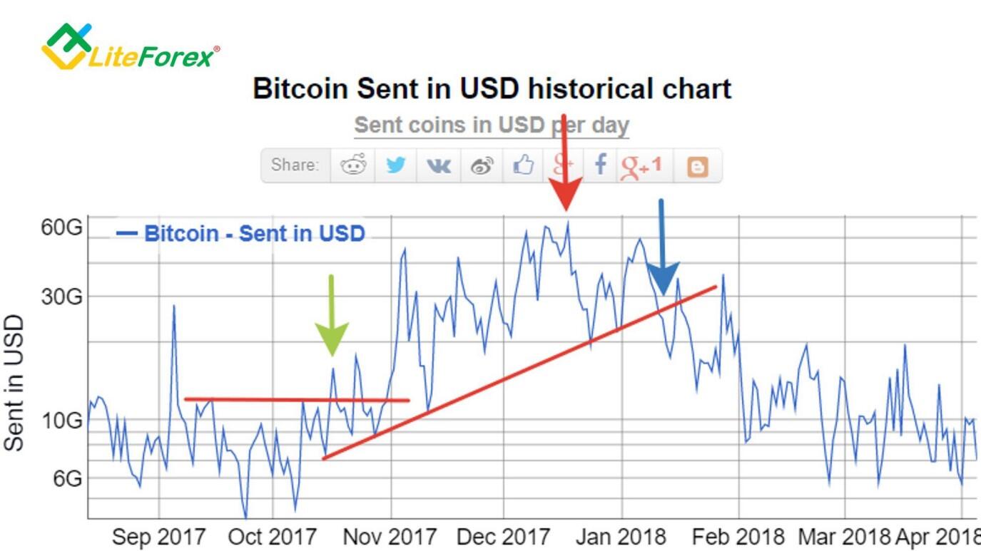
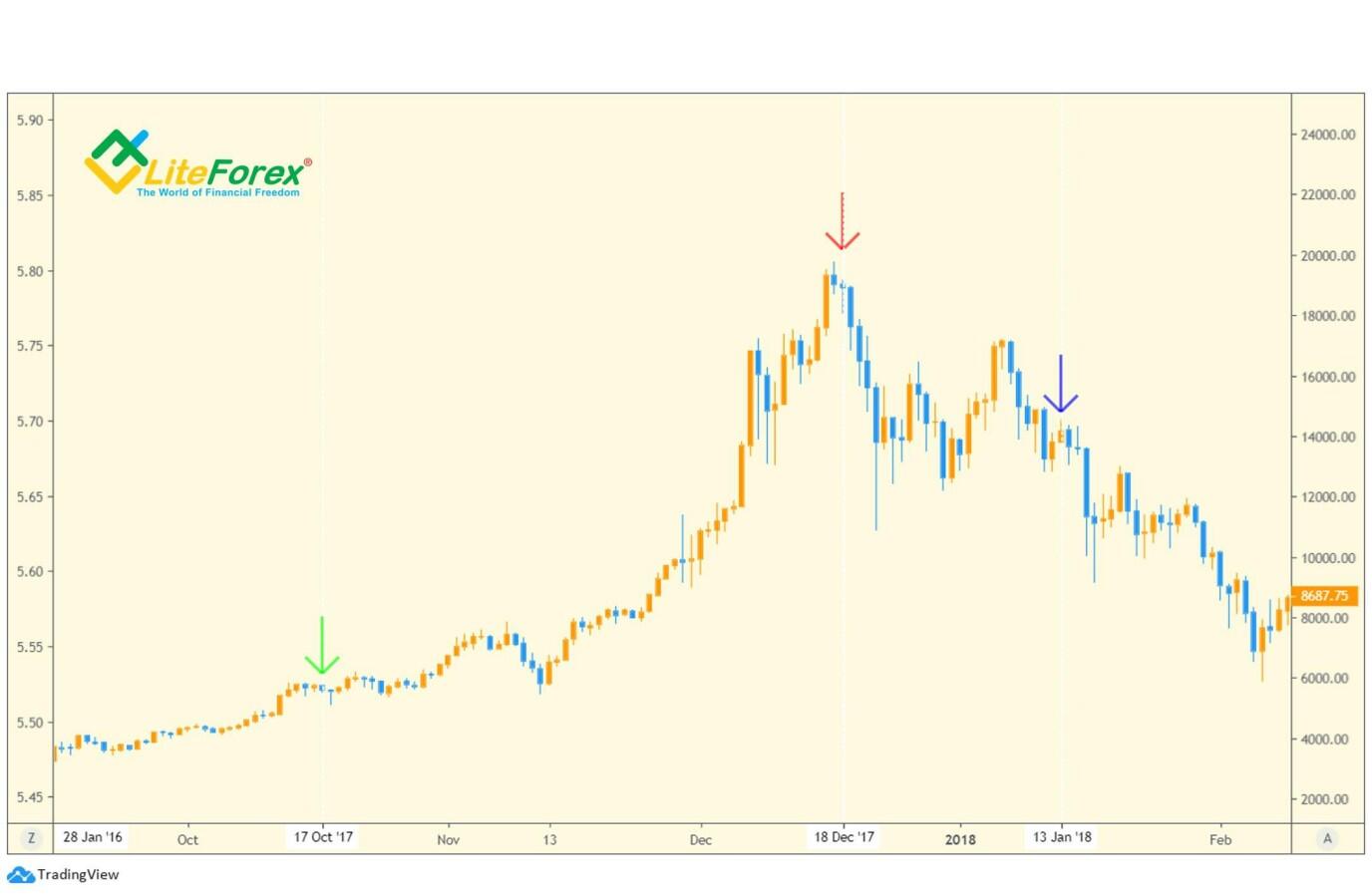
Between October 2017 and January 2018, we see tremendous volumes of transfers. The beginning of the anomaly is around October 17 - this signal is marked by a green arrow. At that moment, there was a surge in the volumes of sent Bitcoins. In the chart, we do not see significant changes. The signal has traditionally become leading by several days.
Further, the key point was the peak in volumes recorded on December 18, 2017. Here we also observe divergence with the price chart. The historical high was not overcome.
We should pay attention to the exit point from the trend of upward volumes, which is located around January 13. We see that at this moment the price has not fallen too much and long position holders had a chance to take profits around 14,000 USD.
And the last surge in the volume of transfers in the Bitcoin blockchain so far fell on the strongest bullish wave of 2019.
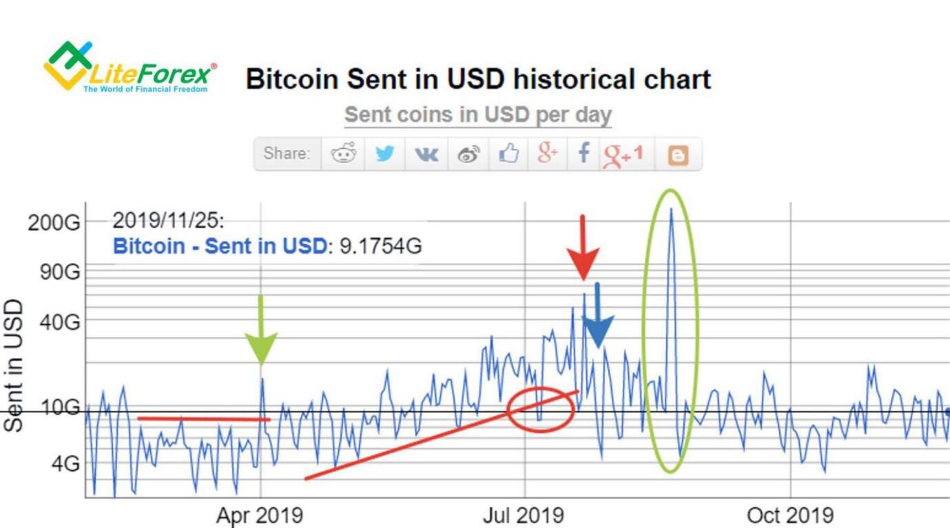
For a start, let's take a closer look at the actual chart of the volumes of sent bitcoins. The 2019 anomaly differs from the rest in its length and a weakly pronounced trend. Moreover, this is the only growth anomaly where you can confidently talk about a false breakdown of the trend (highlighted with a red circle).
Moreover, in this period, after the main growth wave, we saw the strongest surge in the sent coins in the entire history (marked with a green circle).
Let us look at these signals in the price chart.
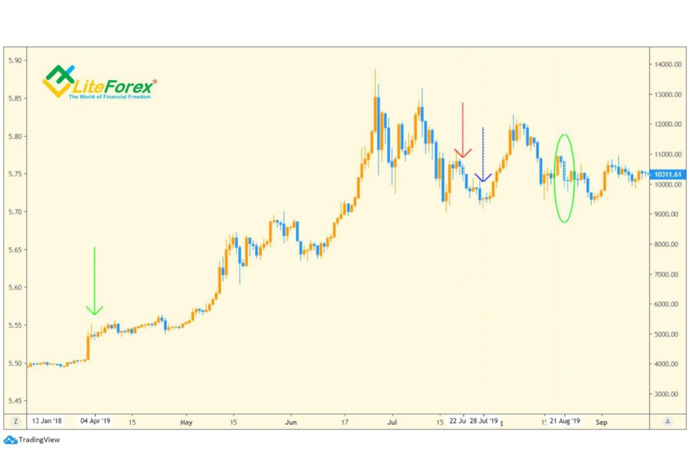
As you can see above, the signal of the beginning of the anomaly really fell at the very beginning of the bullish trend - see the green arrow.
The peak in volume growth - see the red arrow on June 22 - like in most previous cases, was accompanied by divergence, thereby confirming the end of the bullish wave.
The breakdown of the trend is marked with a blue arrow on June 28 and coincided with the low of the bearish correction, therefore, it is not interesting from the trading point of view.
The historical surge in the transferred volumes of bitcoins is of particular interest for our study, which did not affect the chart in any way - see the green circle. On this day, August 21, a small correction occurred in the chart, which is not comparable with the volumes that were transferred in the blockchain.
Conclusion
In general, the six cases studied above are enough to confirm some patterns and talk about certain correlations.
The first correlation, which is also the most pronounced and easy to read, is a divergence between the indicator and the price. The signal works most accurately when the chart of the volume of sent coins updated its high, and the price chart of the asset did not. In all the four cases identified, this signal worked out 100%. The cryptocurrency trend reversed and went into a correction.
Pay attention to the first case under consideration, in which divergence was also detected, but in the reverse order, i.e. the price updated its highs, but the indicator did not. This case is rare enough to talk about its reliability, but it is still divergence, which in general allows us to categorize this case within the statistics of the successful signals.
The second most important signal is a sharp surge in the sent coins in the blockchain. In all cases, it preceded the start of a bullish trend. Moreover, all signals appeared with strong leading in relation to the main period of growth. Considering that the indicator of changes in the volume of sent bitcoins works on a daily timeframe, trading with this indicator will be positional with a large investing horizon. Therefore, when opening a position using the signal of this indicator, be prepared that the main movement will begin no earlier than in 3-4 days. In rare cases, you may have to wait more than a week. At the same time, given the volatility of the instrument, there may be drawdowns and movement against your position at the moment, which must be taken into account when setting the Stop Loss.
The third signal that we considered is a breakdown of the trend line. This signal can be used, but it is ineffective because of its strong delay, therefore it has little value for the trader and, besides confirming what is already visible in the chart - the end of the bullish trend, it rarely tells us anything else.
What is the conclusion? This study showed that the indicator of the sent cryptocurrency has a high potential for the trader and is able to give signals both to enter the position at the first signs of an anomaly and to exit when peak values are reached and there is divergence with the price movement. Obviously, this tool is not a holy grail and gives false signals, as seen in the last case examined. Another significant drawback of this indicator is the fact that it works only in the bullish market. In a bearish trend, this indicator does not give high-quality signals. Another significant limitation is that the indicator is built on a daily TF, which means it is unlikely to be useful for traders with a high-frequency trading strategy. However, for positional traders and investors, this indicator can definitely be interesting, especially in combination with other indicators.
Obviously, the total volumes of sent bitcoins consist of private transfers, and therefore, in order to filter the signals received during the analysis of total volumes, it is important to see and understand the volumes and directions of the main amounts transferred. In the next article, we will study this tool in detail and determine how effective it is for filtering false signals of the indicator of volumes of the sent asset and for early highlighting of signals for early entry into the market.
Good luck!
Faithfully yours,
Michael @Hyipov
P.S. Did you like my article? Share it in social networks: it will be the best "thank you" :)
Ask me questions and comment below. I'll be glad to answer your questions and give necessary explanations.
Useful links:
- I recommend trying to trade with a reliable broker here. The system allows you to trade by yourself or copy successful traders from all across the globe.
- Use my promo code BLOG for getting deposit bonus 50% on LiteFinance platform. Just enter this code in the appropriate field while depositing your trading account.
- Telegram chat for traders: https://t.me/litefinancebrokerchat. We are sharing the signals and trading experience
- Telegram channel with high-quality analytics, Forex reviews, training articles, and other useful things for traders https://t.me/litefinance
Price chart of BTCUSD in real time mode
The content of this article reflects the author’s opinion and does not necessarily reflect the official position of LiteFinance. The material published on this page is provided for informational purposes only and should not be considered as the provision of investment advice for the purposes of Directive 2004/39/EC.