
Finding locations and getting directions is one of the top tasks for users on mobile phones. How quickly and easily users find your location using mobile websites and apps can have a huge effect on the success of your business. Difficulty with finding a location can cause mobile users to turn to a competitor and never come back. And even if users persevered to find your location, their struggles can cost you money through increased customer-service calls to get information that should have been provided by your locator tool.
During our recent usability study of store finders and locators on mobile phones (a continuation of our earlier research on desktop site locators, updated as part of the new edition of the full set of e-commerce UX guidelines), one element that made it difficult to choose a business location was whether the design prominently featured an interactive map to display location search results as opposed to purely a list view. While maps on dedicated mapping apps are generally easy to use, maps presented within mobile sites are often difficult to manipulate by touch and fail to adequately differentiate between location options to help users make their choice.
Panning Interferes with Scrolling
Interactive maps on location search-result pages often end up on the lower half of the screen on mobile devices, and extend below “the fold” of the page. This causes major usability issues for users when they attempt to scroll down the page (to look for a list of results) and instead inadvertently activate the map’s pan functionality. This is a case of swipe ambiguity, which we first discussed in the context of gesture problems on tablet devices and more recently in iOS 7.
When they want to scroll the page, users commonly begin their swiping gesture on the lower half of the screen: this allows the largest scrolling motion and is the most comfortable starting point based on how users typically hold their phone. Often, this gesture ends up panning the map content in place instead of scrolling the page to move the map up on the screen.
The Coffee Bean & Tea Leaf mobile site presents an interactive map above the list of locations on their location search-results page. In our usability testing, users found it difficult to scroll past this map, and they would have preferred just the list view of locations displayed below.

Coffee Bean & Tea Leaf mobile website: The placement of the map caused users to accidentally pan within the map when they intended to scroll the page. The “gutterless” design of this map (the extension of page elements to fill the entire width of the screen rather than leaving whitespace along the edges) further exacerbates this issue by removing any area on the lower portion of the screen where users could grab the page rather than the map.
One way to help mitigate the gesture ambiguity between scrolling the page and panning the map would be to include gutters to the left and right sides of the map, rather than extending it to cover the full screen width. This extra whitespace would then provide some room for users to initiate their scroll gesture on the lower half of the phone screen. Alternatively, the site could provide a text link above the map to hide or collapse it — like Whole Foods does in the screenshot below — that would allow users to bypass the map view if they preferred seeing the list view of results.

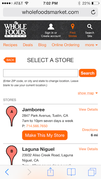
Whole Foods mobile website: The location search-results page presents a link to hide map so users not interested in the graphical display can reach the list view more easily.
Map Pinpoints Do Not Follow Touch-Target Guidelines
Fingers on a touch interface are much less precise than a cursor controlled by a mouse (learn more about fat fingers affecting the usability of touch screens). When presenting a map on a small screen, the pinpoints representing available locations are often placed too closely together due to an inappropriate level of zoom. When touch targets are densely displayed (like in the Ace Hardware example below), they cannot be accurately selected, because a user’s finger pad is too large and can accidentally touch several pinpoints at once.
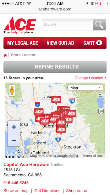
Ace Hardware mobile site: The overlapping map markers on the location search-results page are too small and too densely displayed for fat fingers to accurately select.
Redfin, a real-estate app, tried to solve this problem of crowded pins by aggregating multiple pins into a single icon with a number representing the amount of pins combined. Tapping on one of these number icons zooms the map and displays individual house pinpoints along with aggregated number icons if some points are still too crowded. This solution to reduce the number of targets displayed is tempting, but is confusing to most users and should not be implemented.
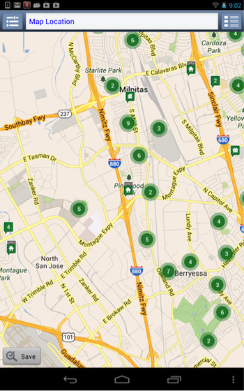
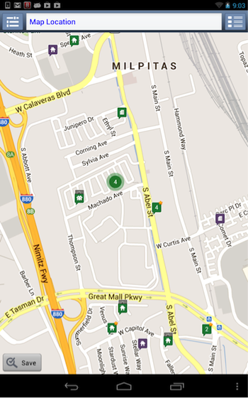
Redfin Android app: Searching for a home returns a map with pinpoints aggregated into numbers. When a number is tapped, the area is zoomed into, and users may see a confusing combination of house icons and more numbers.
Touch Map Manipulations Are Slow and Imprecise
Since mobile users are out in the wild, they often must deal with varying connection speeds. A slow connection can significantly slow down the rendering of the map after panning or zooming and can cause the map to appear unresponsive. Thus, when attempting to manipulate maps, users frequently zoomed or panned farther than intended due to repeating gestures multiple times, in the absence of any feedback from the map. The slow website response time caused users to not only lose their place on the map, but also lose their feeling of control over the interface. When this occurs, users either give up on the map and move to a list view if one is available, or are forced to resubmit their search.
Conclusion – Are Maps Worth the Trouble?
Our test users often said that they like seeing a map when the location search-results page first loaded. However, after attempting to choose a location using the map, the pitfalls outlined above left them frustrated and lengthened the time that they spent on such a simple task. This is yet another example of why the first rule of usability is to not listen to users, but instead to pay attention to what they do.
In mobile site designs that did not include a map on the location search-results page, not a single user commented that they wished that a map had been provided. As long as the distance from the search location was listed, users happily chose a location from the list of results and only cared about a map view on that location’s detail page or when they generated directions. Thus, on mobile websites, maps on location search-results pages can safely be omitted.
On mobile apps, providing the option to toggle to a map view of location results is a good practice, but the default view should be the list layout since it provides a higher information density for location options (as opposed to opening and closing individual pinpoint annotations on a map) and it makes it faster and easier for users to select a location. As one user simply stated, “It would just be easier if they could do a list view as opposed to a map. So a list with your closest mileage location … that helps a lot better than showing a graphical map in my mind.”
Full Report
More guidelines regarding the usability of store finders and locators can be found in the full report available for download. The report contains 58 design guidelines for both desktop and mobile store locators, and is published as a volume of the e-commerce UX report series but can also be read as a standalone report. The guidelines apply to all location finders, whether the locations are stores or other types of places.

